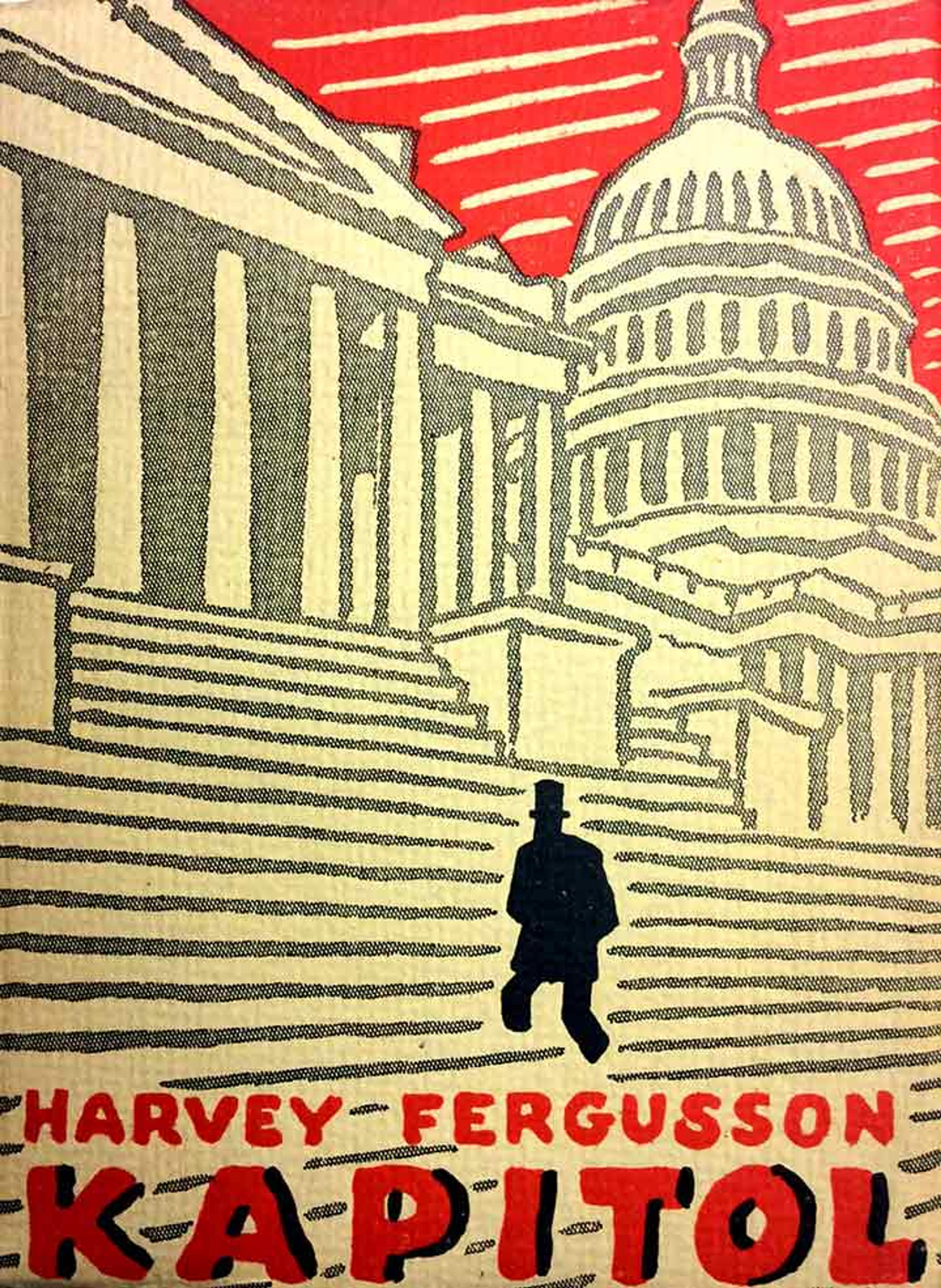
Harvey Fergusson, Kapitol (Praha: Čin, 1926).
«In an earlier post, Walter Schlecht, a former graduate assistant in the Thomas J. Watson Library, introduced our collection of decorative Czech trade bindings and gave a brief history up to the 1920s. This post takes up where he left off by focusing on the innovative and colorful binding designs of Josef Čapek (1887–1945), which were chiefly used on paperbacks. Čapek was an avant-garde Czech artist whose works were heavily influenced by Expressionism and Cubism. He was an extremely prolific printmaker who later turned to creating graphic designs almost exclusively for book illustrations and covers, using the linocut printmaking technique. Čapek often worked with his brother, the author Karel Čapek. Josef Čapek died on April 1, 1945, in the Bergen-Belsen concentration camp in Germany. Much has already been written on Čapek himself, so the focus in this post is on his delightful cover designs and how they artfully depict the contents of various books.»
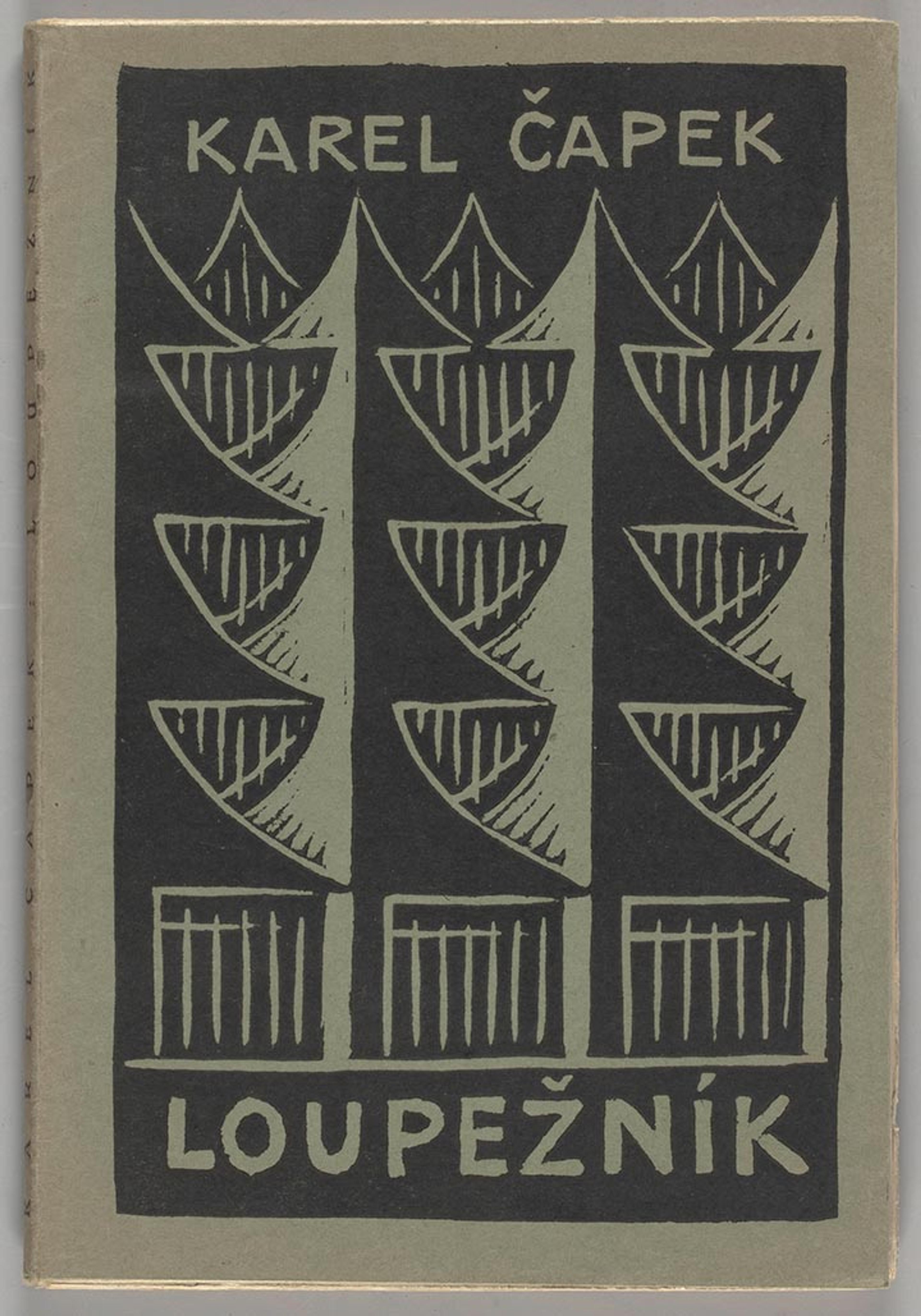
Karel Čapek, Loupežník: komedie o třech dějstvích (Praha: Aventinum, 1920).
Čapek remarkably captures the claustrophobia of a pine forest for the cover of his brother's play The Robber. In the play, the robber comes upon a heavily fortified house in a forest: note how Čapek has illustrated the forest in an abstracted, tightly symmetrical way that emphasizes the captivity (both physical and mental) of the house's inhabitants.
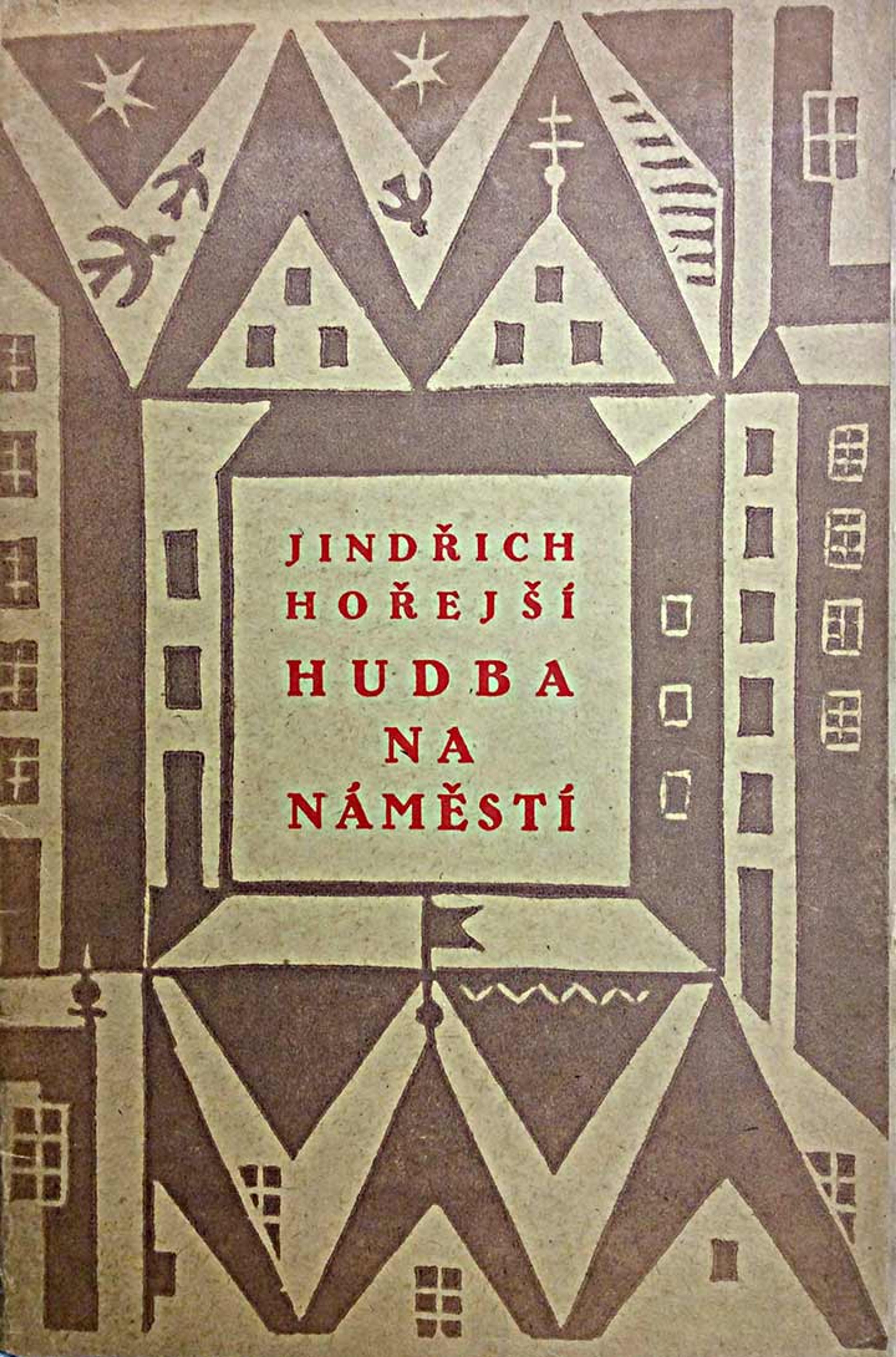
Jindřich Hořejší, Hudba na náměstí (Praha: Vytiskla Legiografie pro Čin, 1921).
For Jindřich Hořejší's book Music on the Square, Čapek has given us a bird's-eye view of a town square: the windows and gables of the buildings surrounding it have been so flattened that the cover seems at first to be nothing but pleasing geometrical patterns. But upon closer scrutiny, the buildings pop into view.
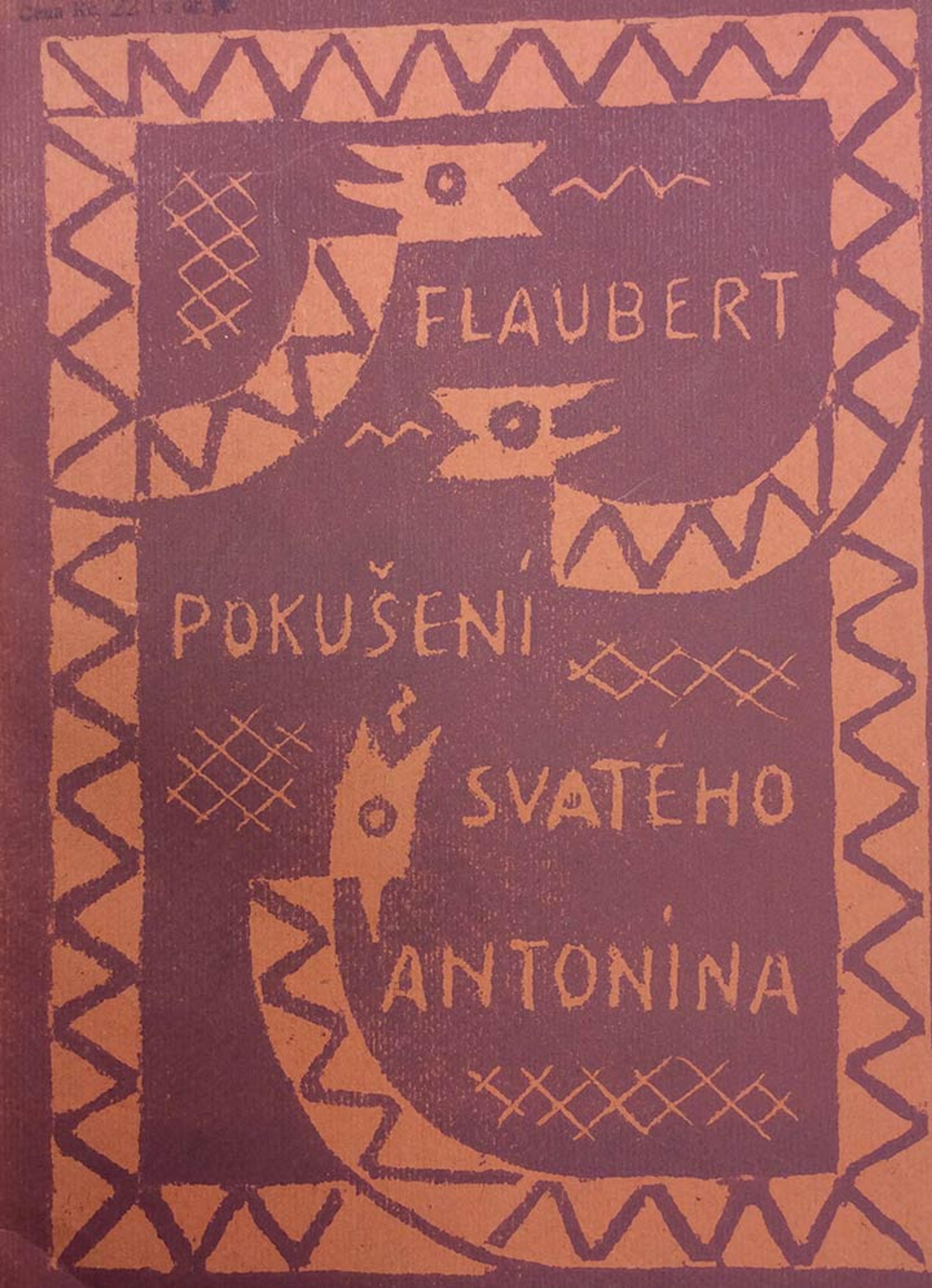
Gustave Flaubert, Pokušení svatého Antonína (Praha: Symposion, Rudolf Škeřik, 1921).
This cover for a translation of Gustave Flaubert's The Temptation of Saint Anthony is one of my personal favorites. Although it is not as colorful nor as detailed as some of Čapek's other cover designs, it succinctly captures the essence of the novel. The title and the author's name are surrounded by a trio of serpents, with a scaly, rectangular border formed by their bodies. We can assume their wavy, projecting tongues are hissing out words of temptation, so that the book's title and Flaubert's name (which stand in for Saint Anthony, who was tempted by supernatural forces) are enveloped by their threatening bodies and their alluring words.
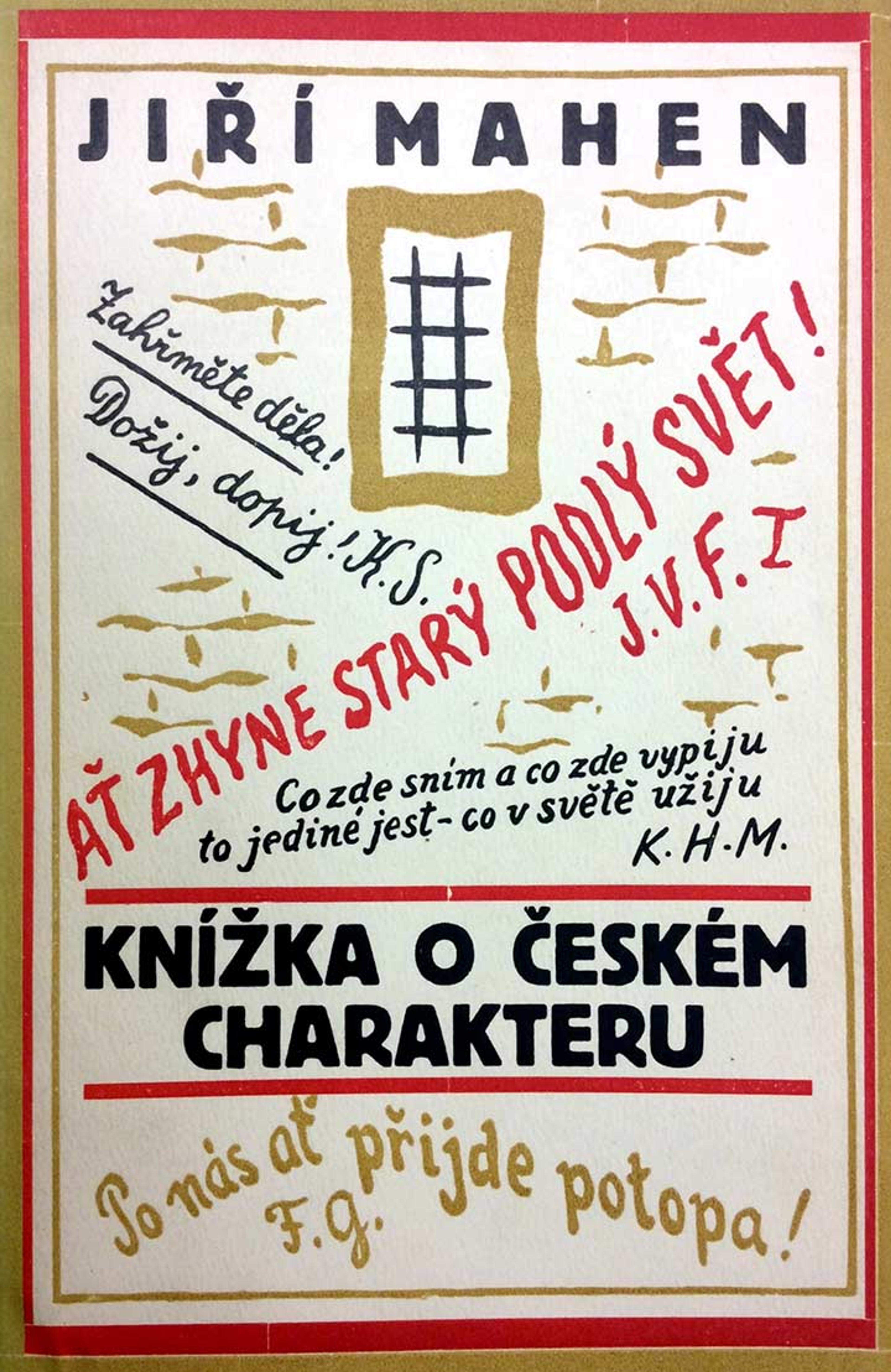
Jiří Mahen, Kniha o českém charakteru (Vyškov: Fr. Obzina, 1924).
On the cover for Jiří Mahen's book on the national character of the Czech people, Čapek cleverly places quotations from Czech writers as if they were the stray thoughts of Czech graffiti artists, hastily scrawled on a wavy brick wall with a barred window in the center.
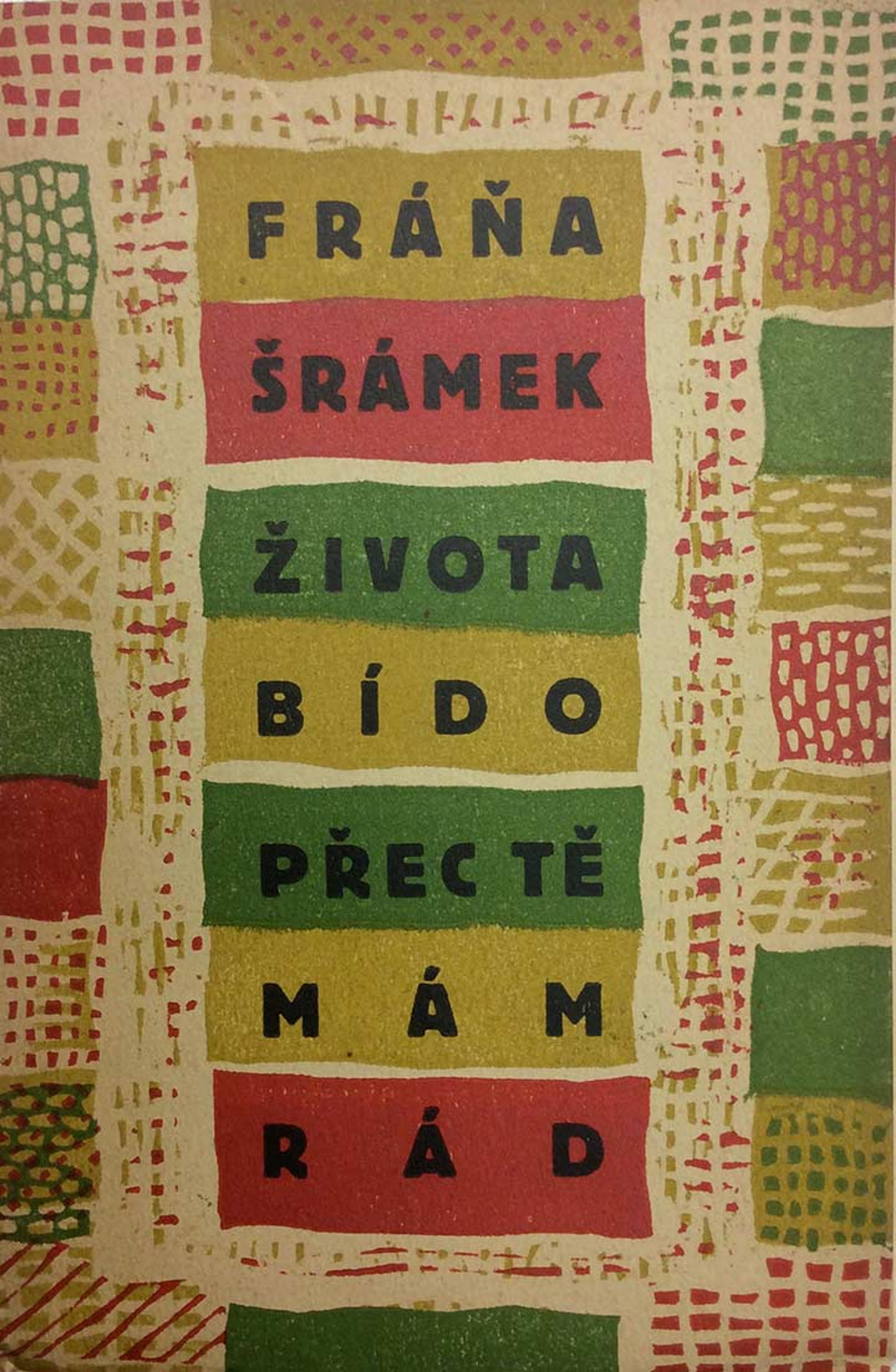
Fráňa Šrámek, Života bído, přec tě mám rád: první básně, 1900-1906(Praha: Ústřední studentské knihkupectví a nakl., 1924).
The cover design for Fráňa Šrámek's book of anti-militaristic poetry seems like an odd choice, but is reflective of Čapek's interest in domestic decorative arts, like oriental carpets and wallpaper. The woven quality of the wavy, symmetrical patterns seem to mimic the irregularities of a colorful, handmade textile fabric.
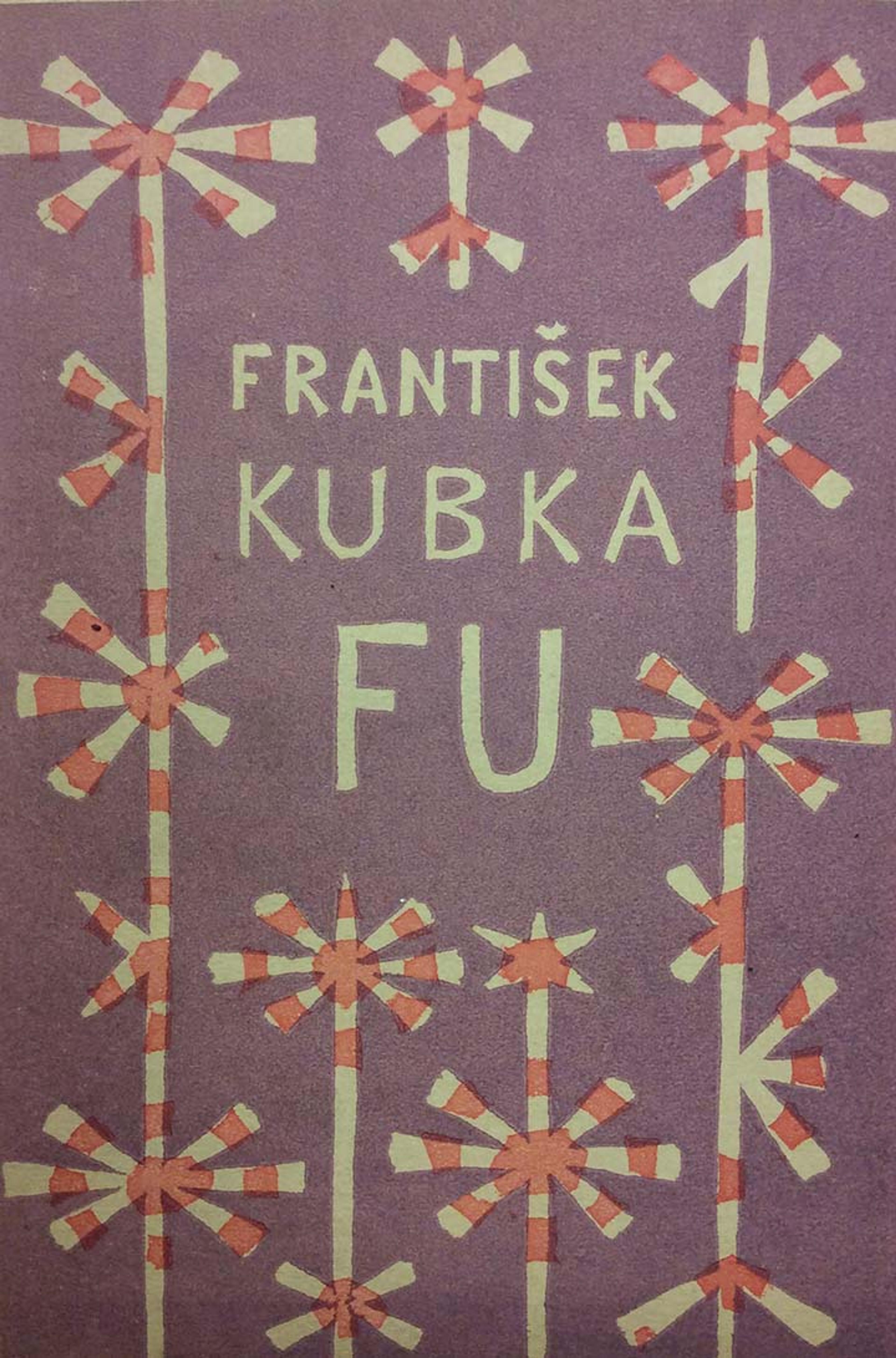
František Kubka, FU (V Praze: Zatiší, Knihy srdce i ducha, 1924).
The paper wrappers on this book by František Kubka are decorated by Čapek with a two-color linocut of a purple and red starburst or flower-design pattern. Art historian Alena Pomajzlová attributes the book's graphic design to Method Kaláb (1885–1963), a Czech graphic artist and typographer.
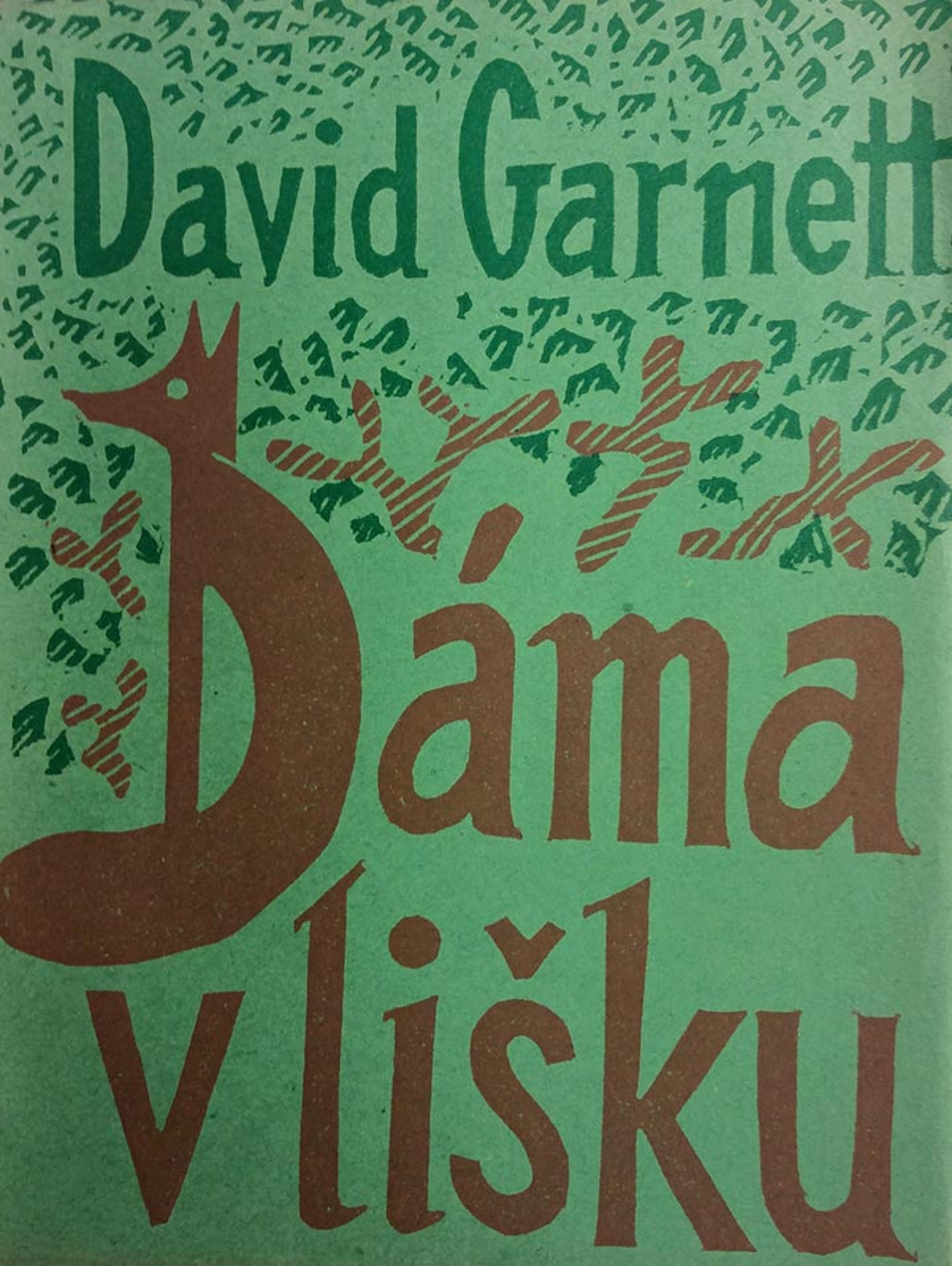
David Garnett, Dáma v lišku (Praha: Čin, 1925).
Čapek loved to play with the typographic elements in his designs. Here, in the Czech translation of David Garnett's Lady into Fox (an enigmatic novel of a woman who is inexplicably transformed into a fox), he has taken the first letter of the title and ingeniously morphed it into the body of a reddish-brown fox with a long, bushy tail seated near some shrubbery.
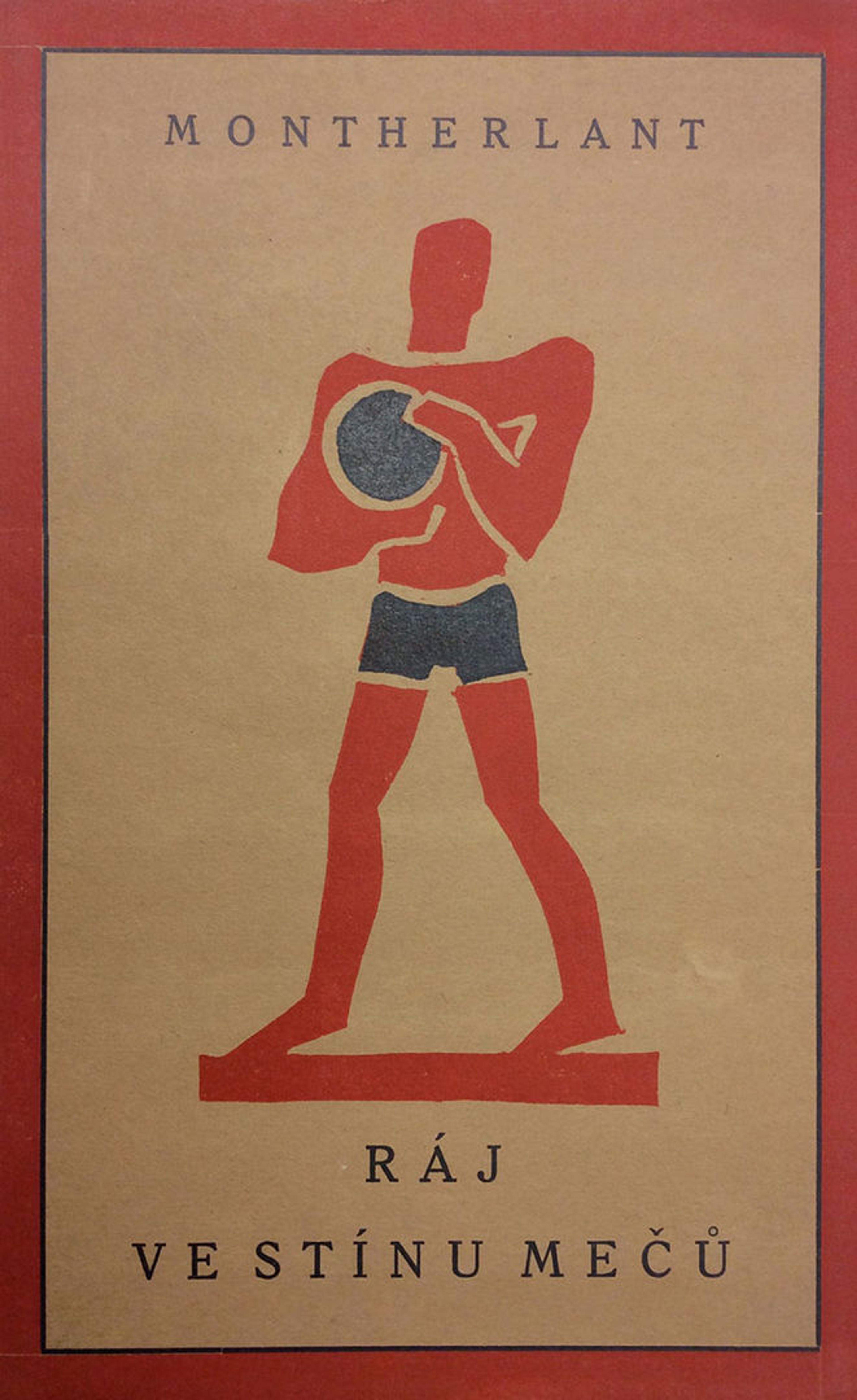
Henry de Montherlant, Ráj ve stínu mečů (Praha: Aventinum, 1926).
Čapek aptly illustrates the cover of this translation of Henry de Montherlant's novel Paradise in the Shadow of the Swords, whose main protagonists are athletes, with a two-color (red and blue) linocut of a man wearing sports trunks and holding a ball. The form and coloration of the body—which seem to hearken back to the static figures depicted in ancient Egyptian or Minoan mural paintings—are Čapek's brilliant nod to the classical allusions made throughout the novel.
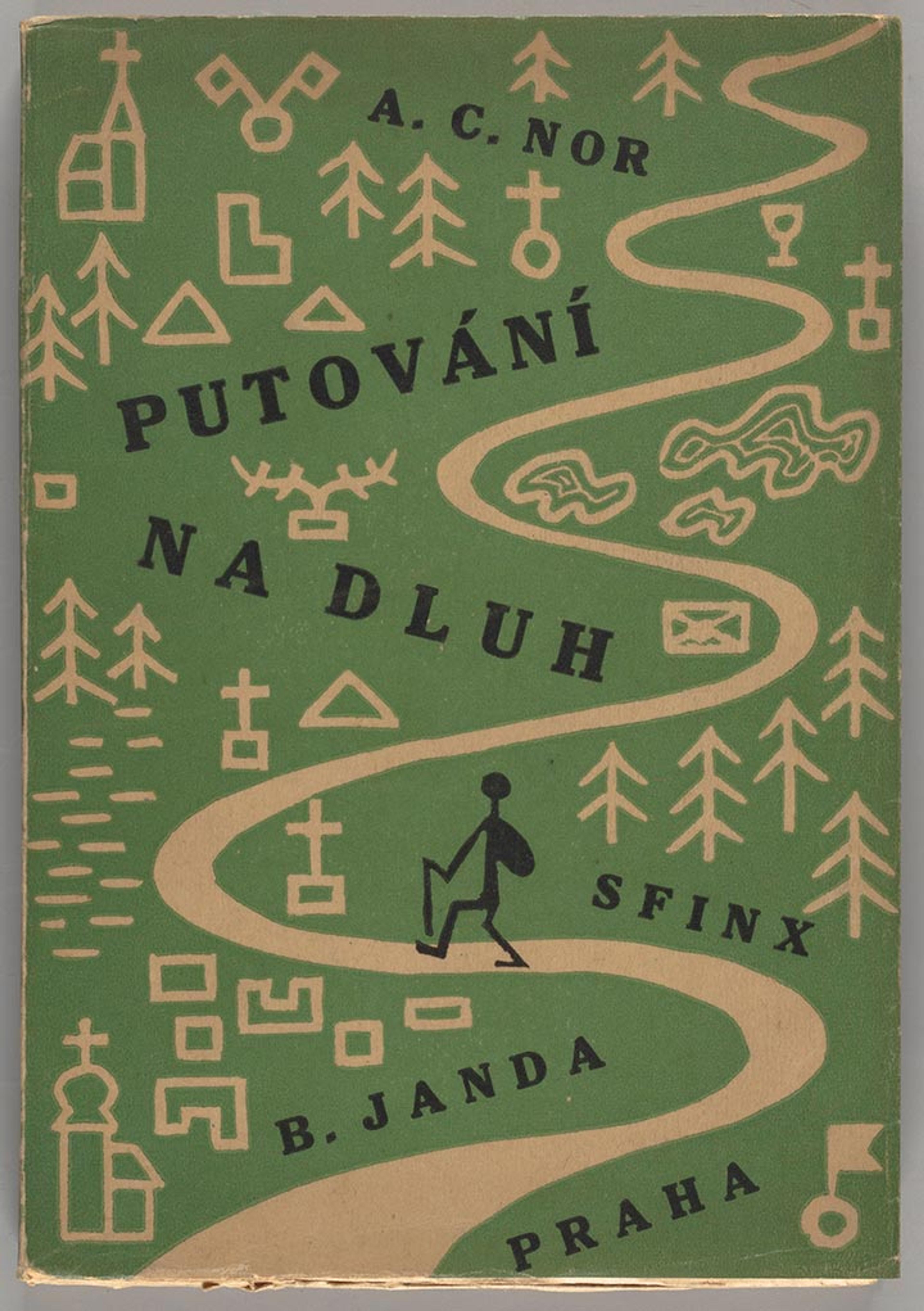
A. C. Nor, Putováni na dluh: feuilletony z toulek a cest (Praha: Sfinx, 1927).
For A. C. Nor's book of essays on traveling, Čapek chose a green and black linocut design depicting a stick figure of a man backpacking up a winding, mountainous path with churches and tombstones along the way. Čapek has minimized the forms so that they are more pictograms than realistic representations of objects.
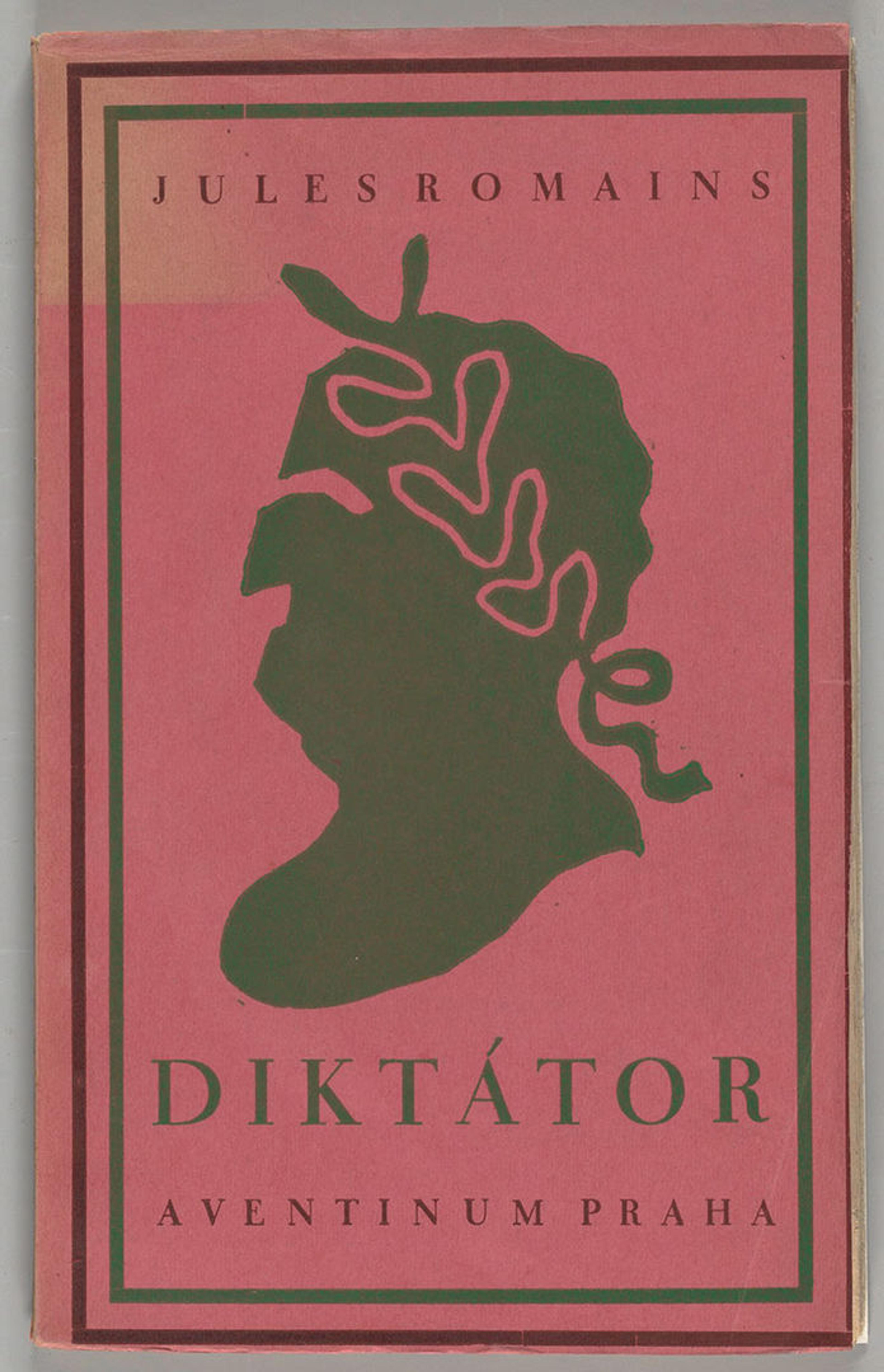
Jules Romains, Diktátor(Praha: Aventinum, 1927).
There is a stark simplicity to Čapek's striking black linocut silhouette of a Roman Emperor's head in profile on the blood red wrappers of Jules Romains's Diktátor: it is almost a caricature of profiles, such as those of Nero, seen on Roman Imperial coinage. Not surprisingly, the profile resembles contemporaneous images of Benito Mussolini, the founder of the Italian Fascist party and later dictator of Italy. Romains's drama is a tale of the travails of a benevolent dictator and is a haunting discourse on power and how best to wield it. Čapek has unquestionably brought out the potentially corrosive effects of supreme power in the craggy linocut design!
To learn more about the work of Čapek, two books in the Thomas J. Watson Library that might be of interest are Alena Pomajzlová's Seeing the Book: The Book Design of Josef Čapek and Vladimír Thiele's Josef Čapek a kniha: soupis knižní grafiky.