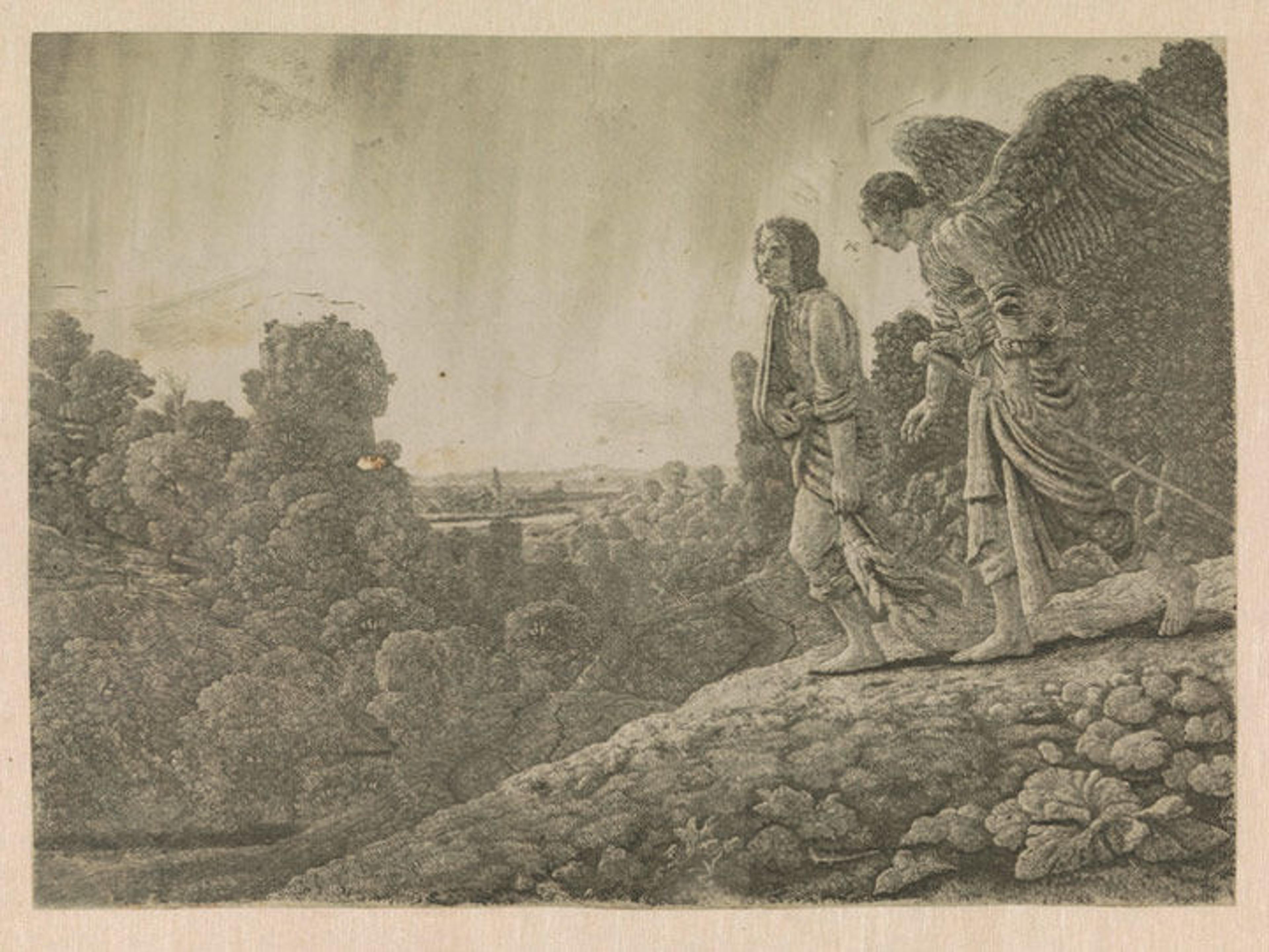
Hercules Segers (Dutch, ca. 1590–ca. 1638). Tobias and the Angel, ca. 1630–33. Line etching printed in olive green with tone and highlights, first state of six, Sheet: 7 15/16 x 10 7/8 in. (20.1 x 27.6 cm). Rijksmuseum, Amsterdam; transferred from the Koninklijke Bibliotheek, collection Pieter Cornelis Baron van Leyden (1717–1788), 1816 (inv.nr. RP-P-OB-796)
«Tobias and the Angel is one of Hercules Segers's most beautiful and delicately etched works. The print is perhaps best known as the one reworked by Rembrandt, who, when he later owned the plate, burnished away the figures and some of the foreground elements and then scratched new figures into the printing plate using a drypoint needle, changing the subject of the print to The Flight into Egypt. This rare picture exists in only two impressions before Rembrandt's reworking, both of which were printed in olive-green ink: the impression now on view in The Mysterious Landscapes of Hercules Segers, which comes from the Rijksmuseum in Amsterdam; and another one in the collection of the Musée du Louvre in Paris.»
Evidence provided by dating the watermarks in the papers indicates that Segers printed the work late in his career, around 1632, and this maturity shows in the way he executed the print. To create this etching, Segers employed a complicated three-tone etching process that he had developed previously.
Left: Tobias and the Angel (detail)
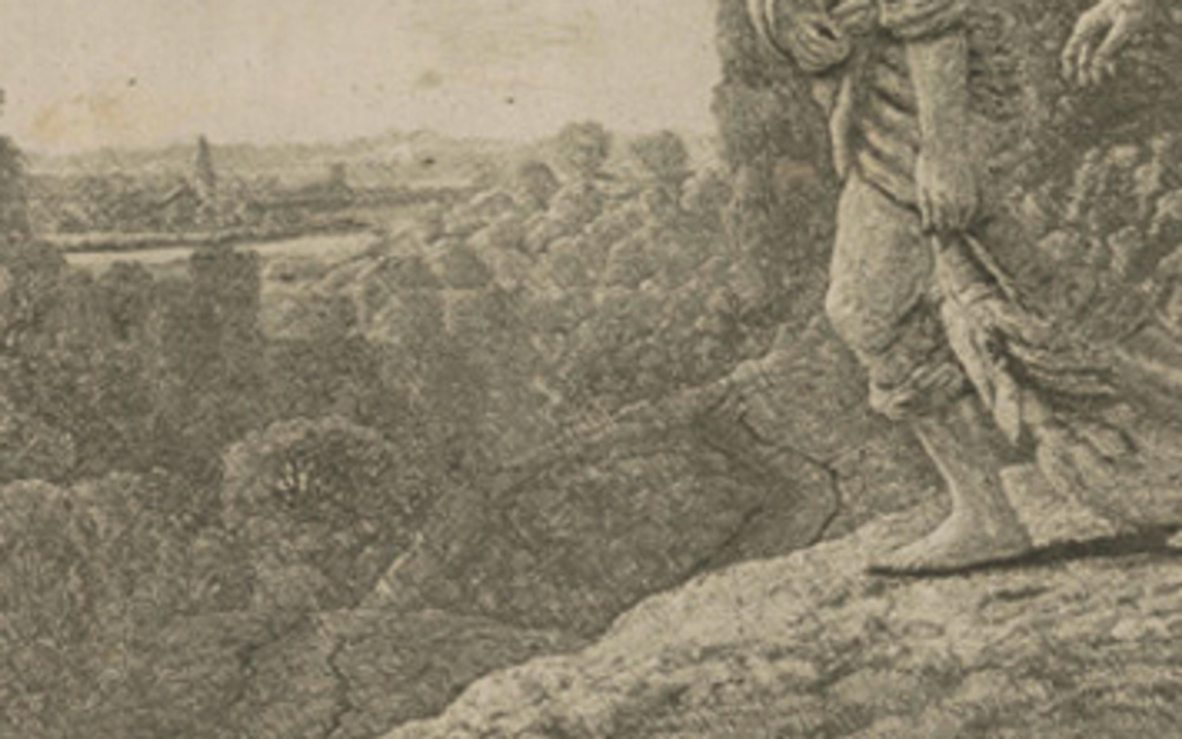
The pronounced diagonal hatching that we see in the detail at left maintains traces of the original layer of hatched lines that Segers applied to his printing plate. At that stage, he also applied a solution of animal fat mixed with oil or pine resin dissolved in turpentine, now known as stopping-out varnish. Segers applied this varnish to the areas where he wanted to create white highlights, evidenced here in the areas of the print that have no lines. The varnish once applied would protect those parts of the copper printing plate from being bitten by the etching acid.
This technique was uniquely Segers's invention; no one else had made prints like this before him and no one has made them since. One reason may be that it is a difficult process to master, as evidenced by one of Segers's earlier attempts, Rocky Landscape with a Road and a River.
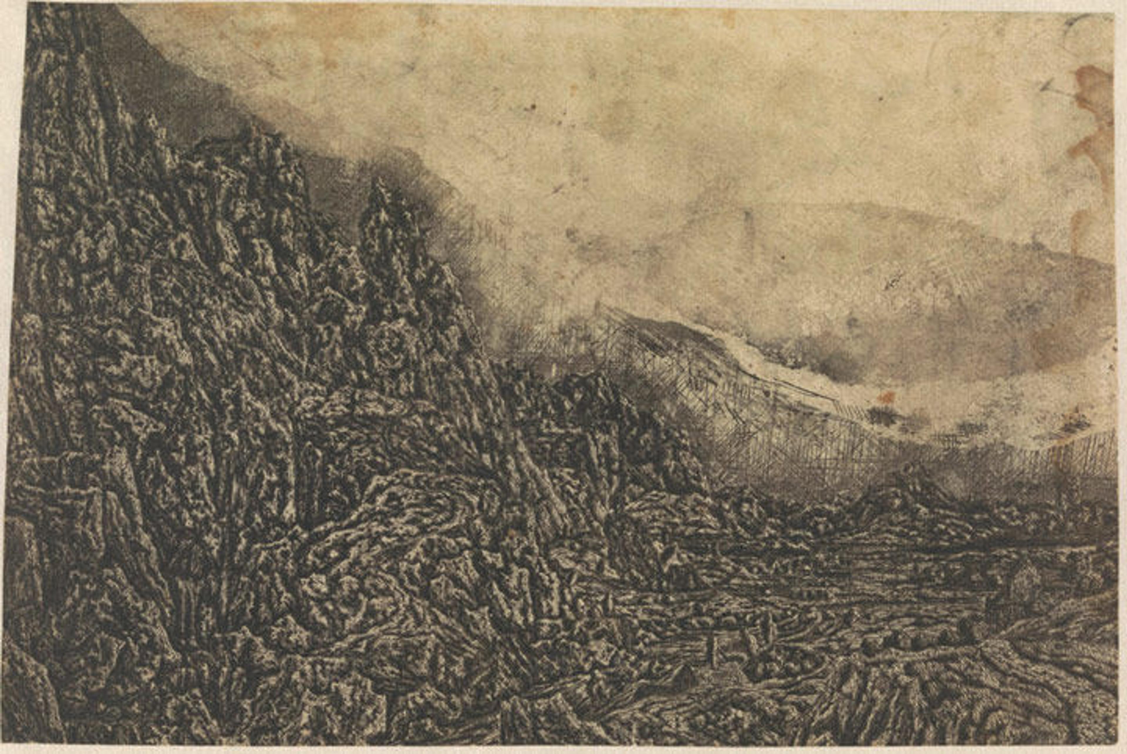
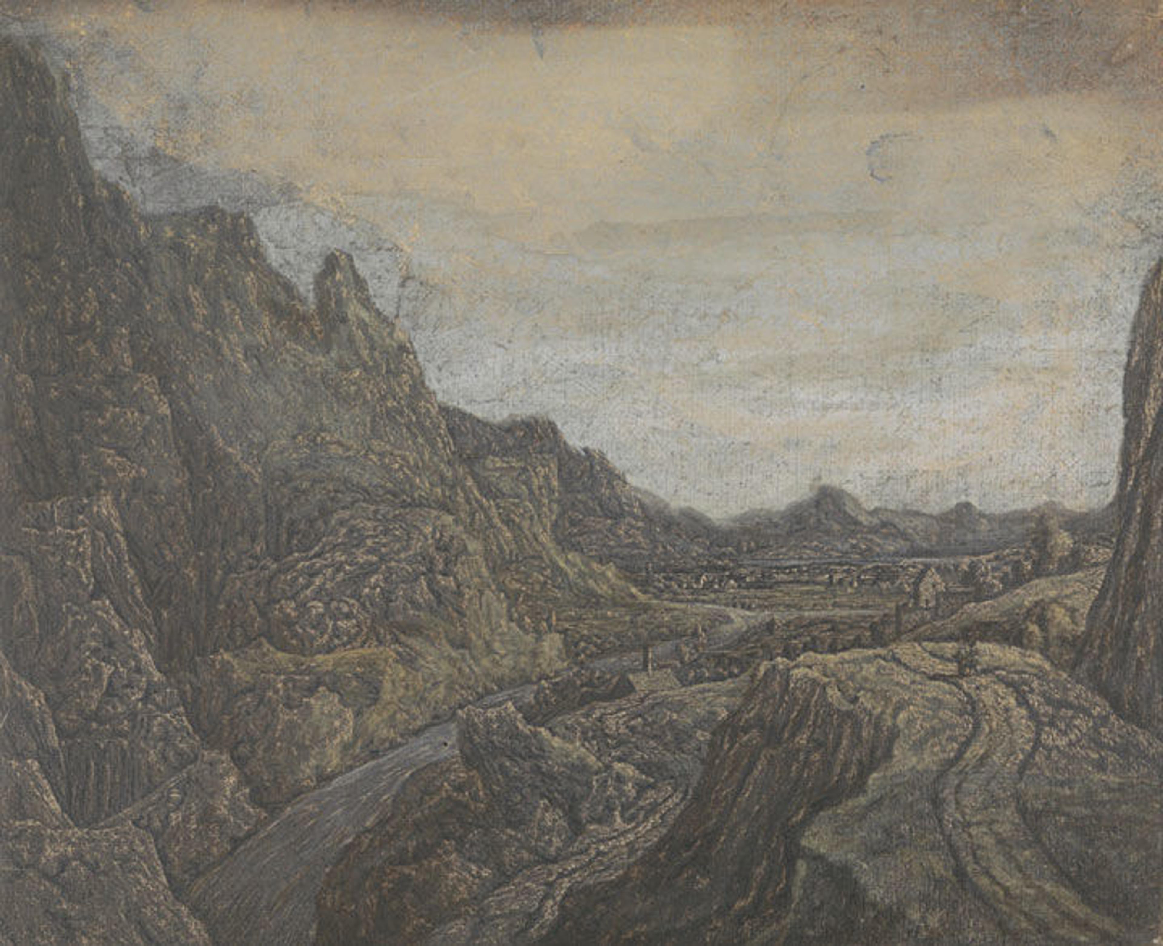
Hercules Segers (Dutch, ca. 1590–ca. 1638). Rocky Landscape with a Road and a River, ca. 1622–25. Line etching; unique impression of the second state of two, Sheet: 6 7/16 x 9 11/16 in. (16.3 x 24.6 cm). Rijksmuseum, Amsterdam; on loan from the City of Amsterdam, collection Michiel Hinloopen (1619–1708), 1885 (inv. no. RP-P-H-OB-833)
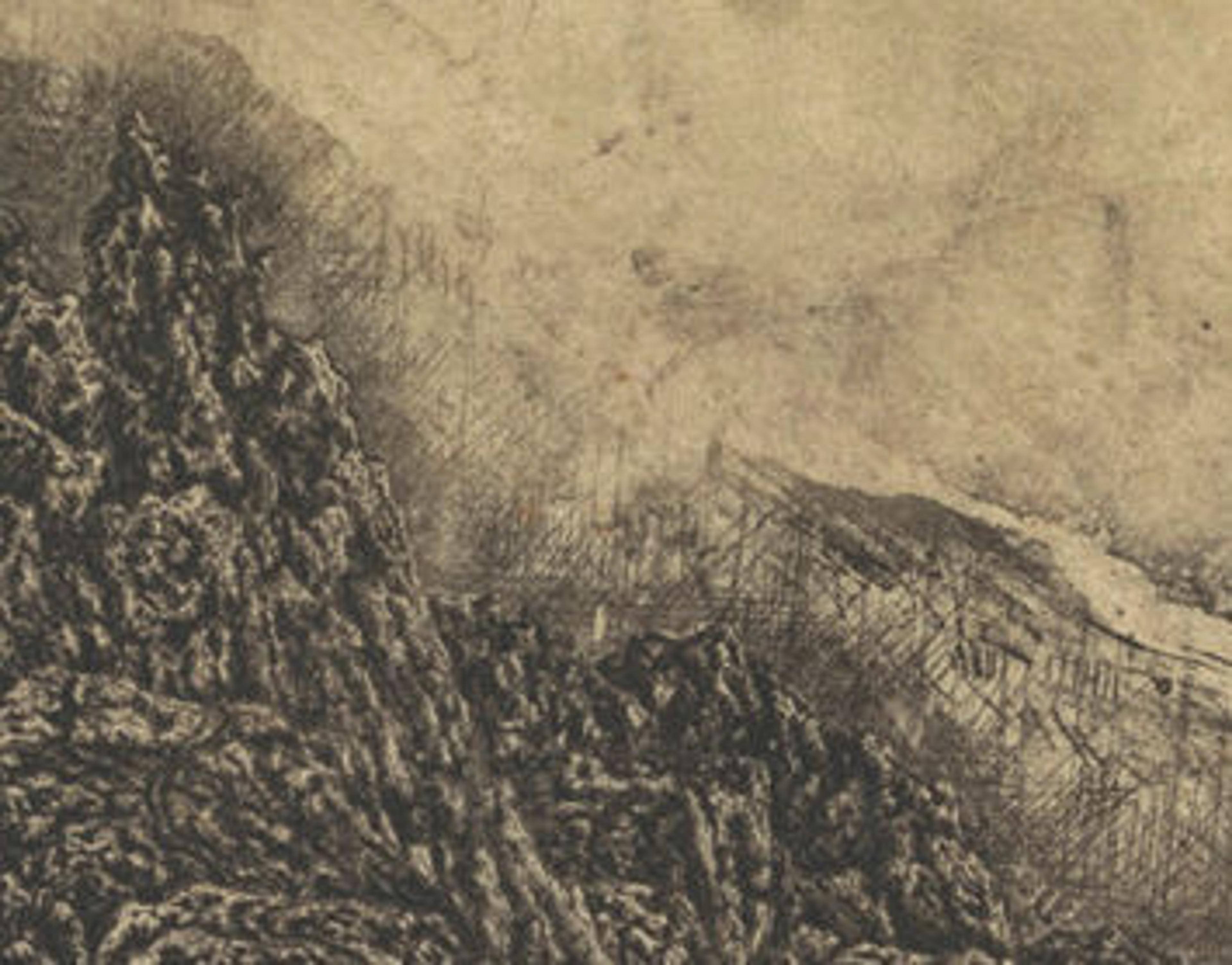
In the detail at right, the cross-hatching that originally covered the plate is still visible along the edge of the mountain. The white, gray, and black tones roughly converge; they do not flow together as delicately as in Tobias and the Angel. The large blotches in the sky were made by the turpentine in the stopping-out varnish reacting with the etching ground.
Right: Rocky Landscape with a Road and a River (detail)
Another impression of the same print (below) shows that after all of this intense work, Segers painted right over the print to create what a contemporary of his called "printed paintings." The underlying etching, however, adds an overall texture to the work.
Hercules Segers (Dutch, ca. 1590–ca. 1638). Rocky Landscape with a Road and a River, ca. 1622–25. Line etching printed on a pink-white ground, colored with brush; unique impression of the first state of two, Sheet: 9 5/16 x 11 1/4 in. (23.6 x 28.5 cm). Rijksmuseum, Amsterdam; transferred from the Koninklijke Bibliotheek, collection Pieter Cornelis Baron van Leyden (1717–1788), 1816 (inv. no. RP-P-OB-832)
Segers used this technique again in The Large Tree, but here he was more specific in defining what each of the tones would communicate. The white highlights and black etched lines play off each other in the foliage throughout, creating a shimmering effect that runs through the print. He used the gray tones created with cross-hatching to delineate areas with texture like the bark on the tree and the houses, while hatched lines are apparent in the sky behind the tree.
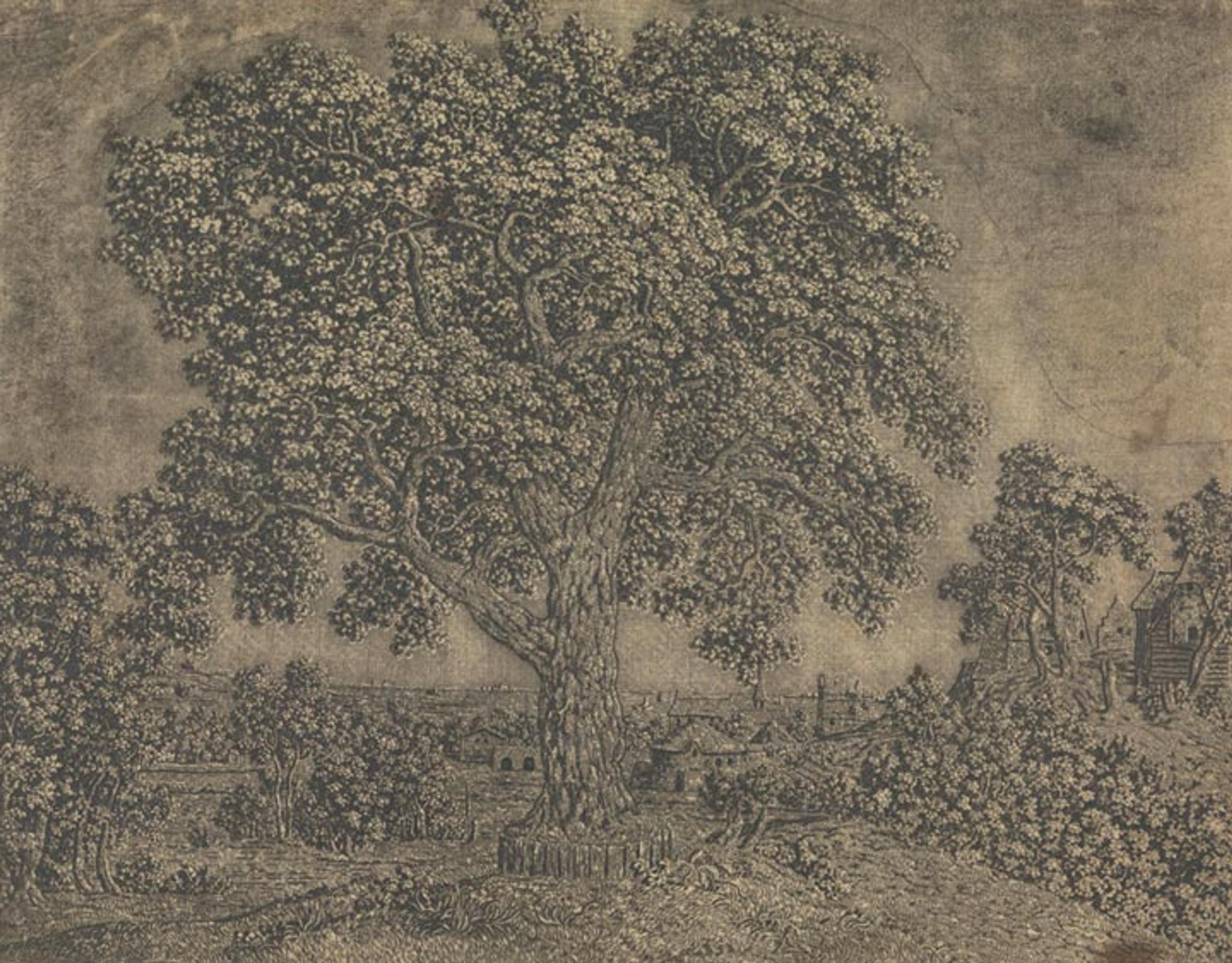
Hercules Segers (Dutch, ca. 1590–ca. 1638). The Large Tree, ca. 1628–29. Line etching printed with tone and highlights, black chalk, Sheet: 8 9/16 x 10 7/8 in. (21.8 x 27.7 cm). Rijksmuseum, Amsterdam; transferred from the Koninklijke Bibliotheek, collection of Pieter Cornelis Baron van Leyden (1717–1788), 1816 (inv. RP-P-OB-849)
Segers's Three-Tone Etching Process
Segers invented a labor-intensive method of creating prints with three tones: highlights, middle tones, and dark tones. Here is how he did it:
- With an etching needle and a ruler, he created patterns of dense cross-hatching through the ground. This would be his middle tone.
- With stopping-out varnish and a brush, he painted on the areas that would be the highlights.
- He briefly bit the plate in acid so that the grooves of the cross-hatching would be able to contain only a little ink in order to create a light tone.
- He then covered the plate with ground a second time.
- With an etching needle, he drew in the dark lines.
- He bit the plate in acid a second time for a longer length of time, so that the newly etched grooves would be deeper and wider in order to appear darker when printed.
- He then cleaned the plate, inked it, and printed it.
Related Links
The Mysterious Landscapes of Hercules Segers, on view at The Met Fifth Avenue through May 21, 2017
Now at The Met: View all blog articles related to this exhibition.
Compare different impressions of Hercules Segers's work in an interactive web feature, Infinite Variations: A Closer Look at Segers's Prints, composed by Robert G. Erdmann, senior scientist at the Rijksmuseum, Amsterdam.