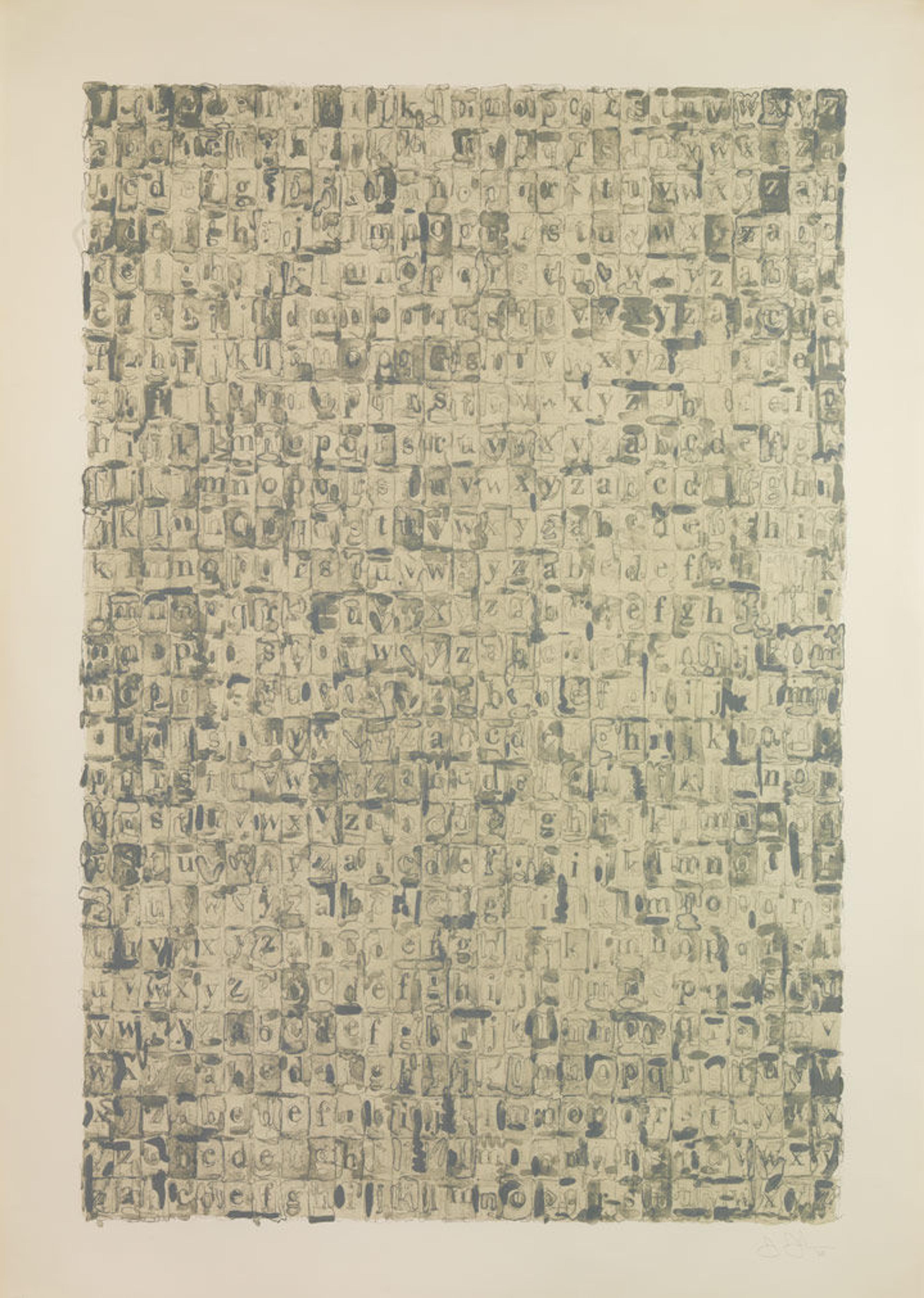
Jasper Johns (American, born Augusta, Georgia, 1930). Gray Alphabets, 1968. Published by Gemini G.E.L. Lithograph; 60 x 42 in. (152.4 x 106.6 cm). The Metropolitan Museum of Art, New York, Stewart S. MacDermott Fund, 1968 (68.689)
«In a previous blog post, I examined how members of 20th-century European avant-garde groups—namely the Futurists, Dadaists, and Lettrists—engaged letters and, by extension, language in their work. We can continue this discussion by looking at other selected prints included in the exhibition Wordplay: Matthias Buchinger's Drawings from the Collection of Ricky Jay, on view through April 11, that were made by contemporary American artists, with particular attention to the work and influence of Jasper Johns.»
Jasper Johns
Since the mid-1950s, Johns has depicted everyday icons and emblems, or what the artist famously referred to as "things the mind already knows." In the process, he has fundamentally challenged ideas about what art can be. One of the motifs to which he has returned numerous times has been the alphabet. Johns has repeatedly used letters, either depicted individually or layered atop one another, to address modes of perception and knowledge. Johns's 1956 painting Gray Alphabets was his first engagement with the alphabet, as well as the first time he used the word "gray," a recurring color in his oeuvre, in a title.
In Gray Alphabets, Johns plays with the tension between the allover composition and the discrete forms within each unit. He used four matrices in order to evoke the shimmering effects of graphite. Due to the variation in colors, marks, and forms, the letters simultaneously reflect an established order, an effect amplified by the grid structure, while also remaining unique. The rectangular shapes and illusion of a raised surface are reminiscent of the wooden blocks used by children for both play and learning, which are literally the building blocks of language. Yet by showing line after line of the letters repeated in standardized order without commentary or development, Johns negates this function, instead showing a stream of information without a resolution.
Johns's Alphabet, made the following year, is believed to be the first work in which he portrayed the entire set of 26 letters, superimposed in alphabetical order. The letters have an elegant yet impersonal feel and appear as if they were stenciled, thus signaling both an absence of the artist's personal touch and the official information-granting capacity in which letters are employed. Despite the recognizable subject and elements, Alphabet becomes a nearly abstract composition because of the number and complexity of the various tangled and intertwined forms.
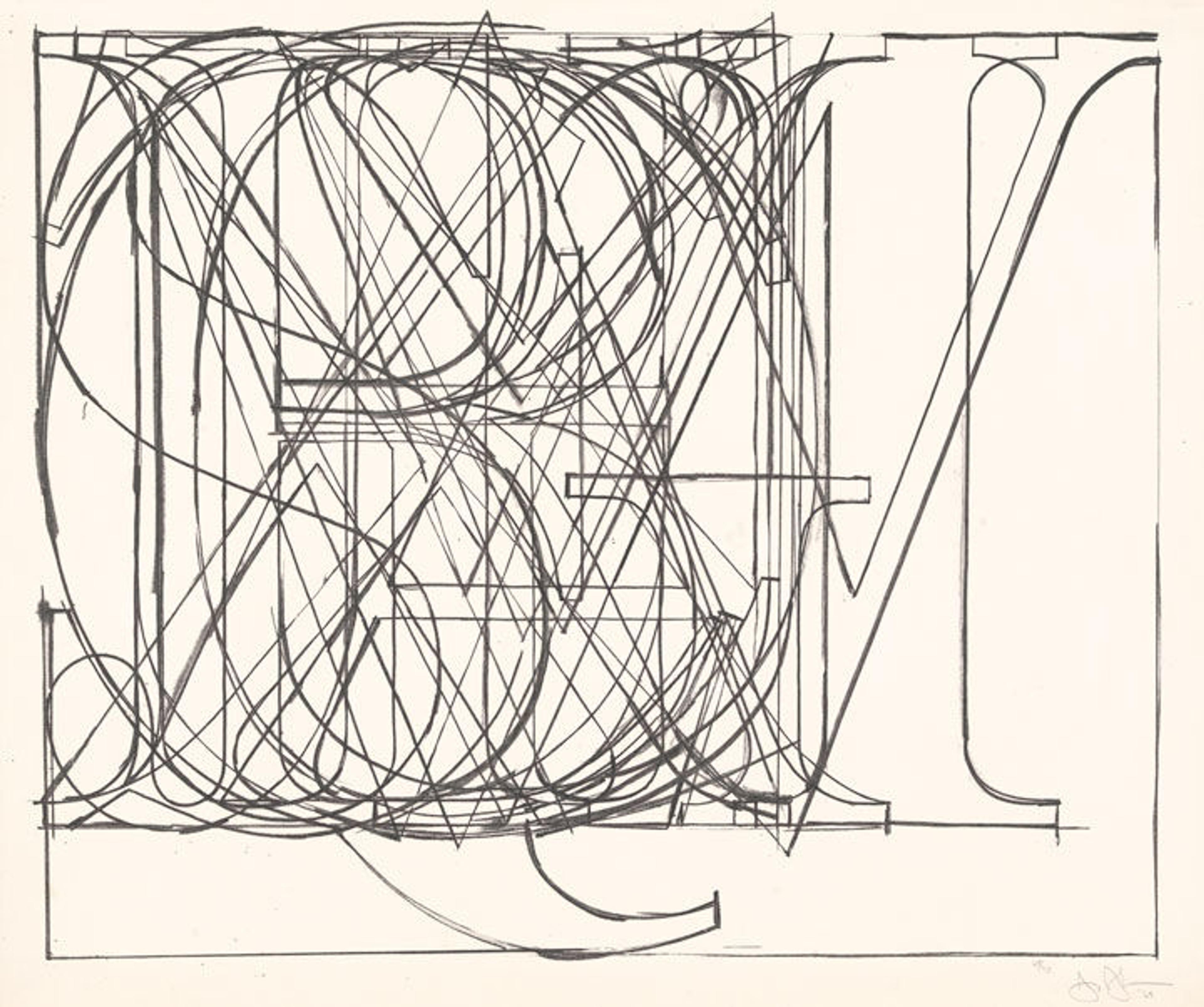
Jasper Johns (American, born Augusta, Georgia, 1930). Alphabet, 1969. Lithograph; 31 x 37 in. (78.7 x 94 cm). The Metropolitan Museum of Art, New York, Florence and Joseph Singer Collection, 1972 (1972.733)
Johns has revealed a continued engagement with the nature of perception and the ways in which thoughts are constructed and communicated. Made in 2013, Untitled is composed of three distinct bands containing motifs found in his art throughout the decades: the top register houses numbers running from zero to nine, the center features a map of the United States, and the bottom presents letters in American Sign Language. The irregular gray and black tones and pools of ink represent Johns's attempt to capture the aesthetic of ink on plastic—a material he has depicted in his drawings since 1962—in a print.
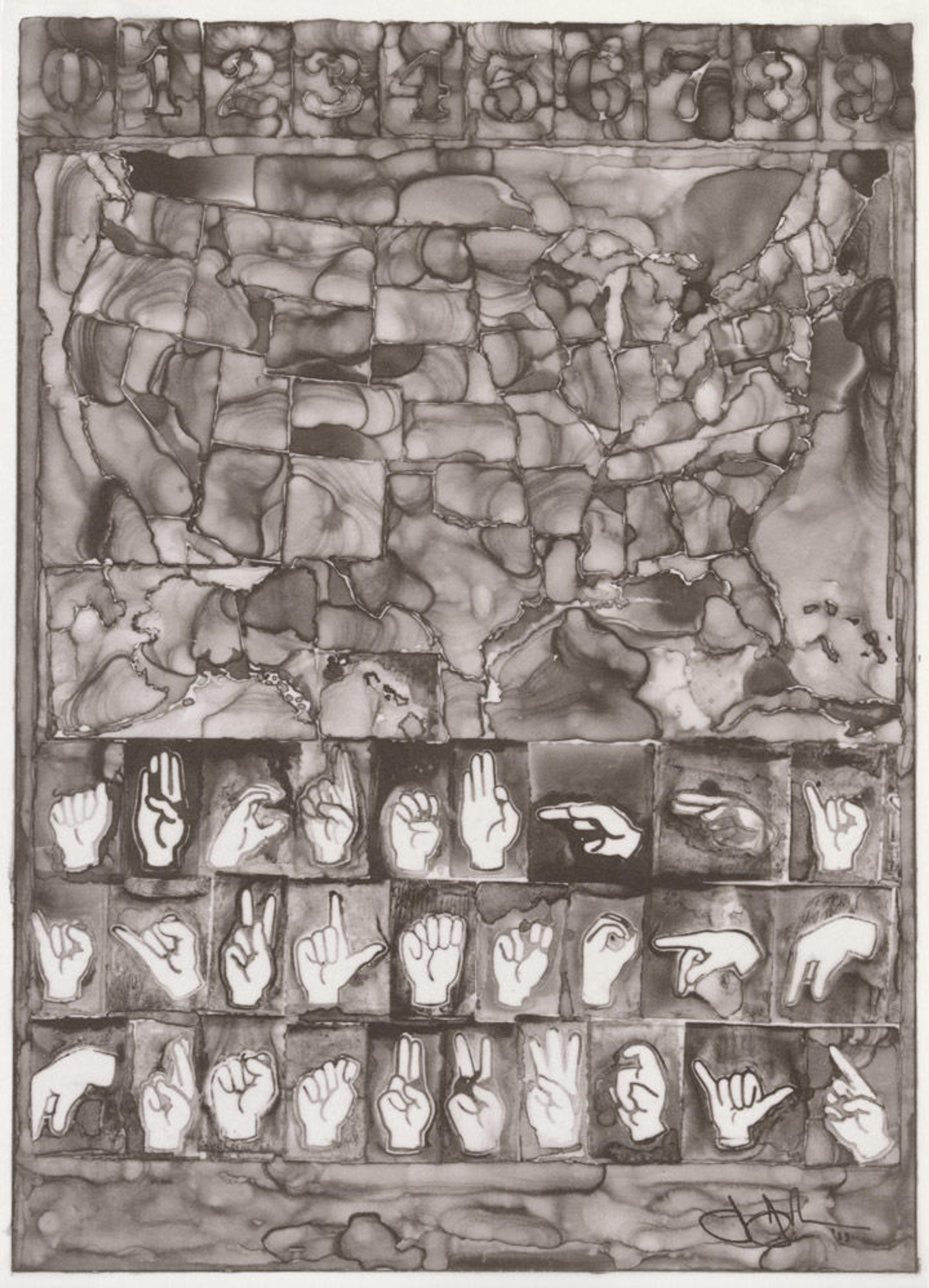
Jasper Johns (American, born Augusta, Georgia, 1930). Untitled, 2013. Printed by Universal Limited Art Editions, Inc. for Art in America magazine. Published by Sharon Coplan Hurowitz. Offset lithograph on Giama Natural paper; Sheet: 10 7/8 x 15 1/8 in. (27.6 x 38.4 cm). Gift of Sharon and Richard Hurowitz, 2015 (2015.399)
This is the first work Johns created using digital technology. He drew the various components, including his signature, on different sheets of paper that Bill Goldston, master printer and director of Universal Limited Art Editions, then combined digitally for the artist's approval.
Christopher Wool
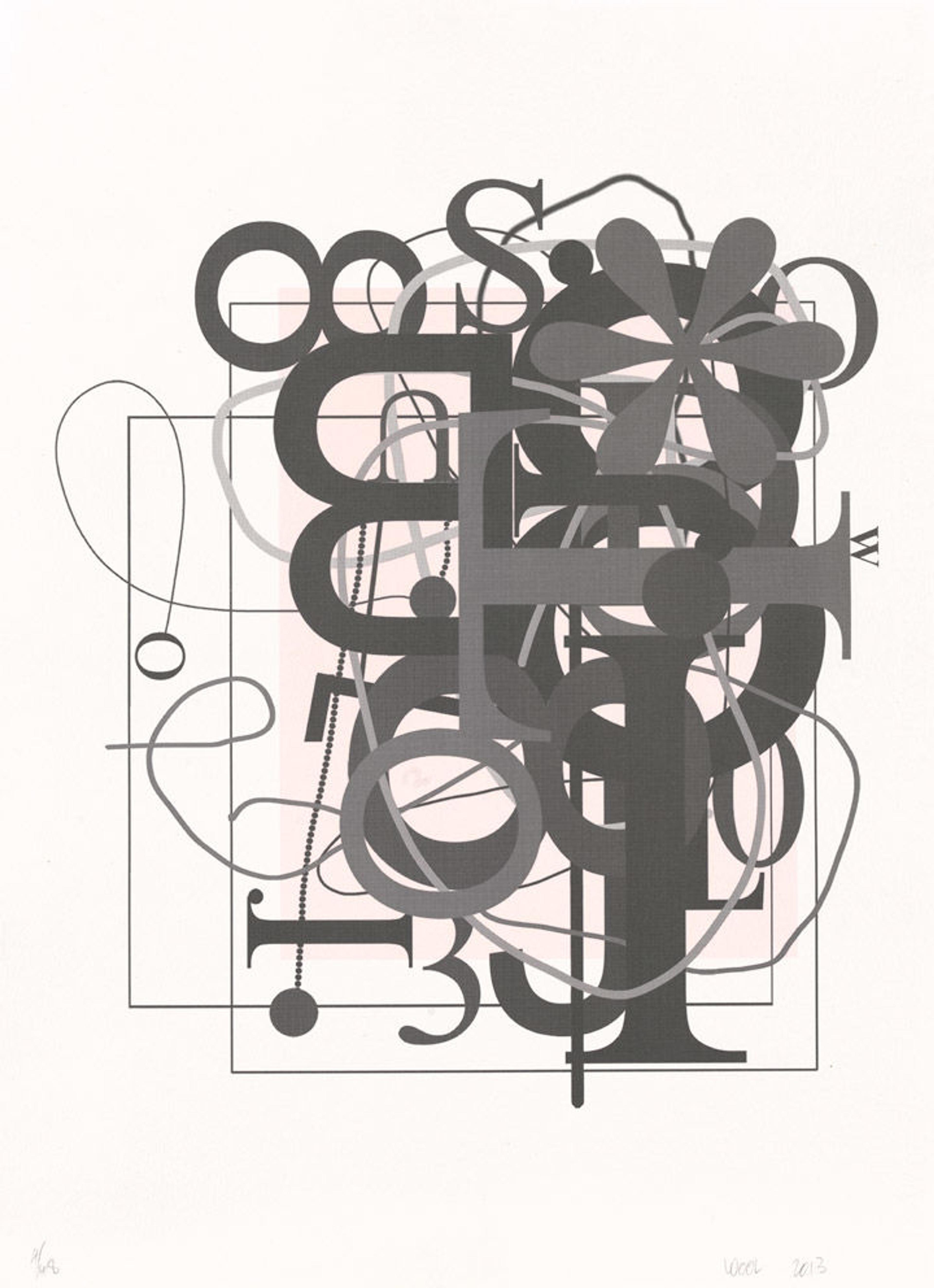
Christopher Wool (American, born Chicago, 1955). Untitled, 2013. Lithograph; Sheet: 30 1/2 x 22 1/2 in. (77.5 x 57.2 cm). The Metropolitan Museum of Art, New York, John B. Turner Fund, 2014 (2014.237)
Like Johns, Christopher Wool has examined the relationship, and subsequent tensions, between text and image and between reading and seeing. The large black, stenciled letters of his "word paintings," which contain either single or multiple words decontextualized and without punctuation, possess a graphic power and strangeness that is amplified by their stark white background. In this untitled print, however, Wool focuses on the forms of letters themselves, liberated from linguistic responsibilities.
Rendered in gray tones against a background of muted pink and white, the letters vary in size, font, and orientation. Their gracefully curved forms frequently become entangled with one another as well as with the blurred gray skeins strung across the image's surface. The decorative elements, such as floral forms and beaded lines, create a sense of levity interspersed across the composition. As opposed to the structure of Wool's "word paintings," which evoke the grid-like orientation of Gray Alphabets, the collage-like aesthetic, shifting planes, and layers of color and forms in Untitled introduce a dynamic tension that reverberates throughout the composition.
Glenn Ligon
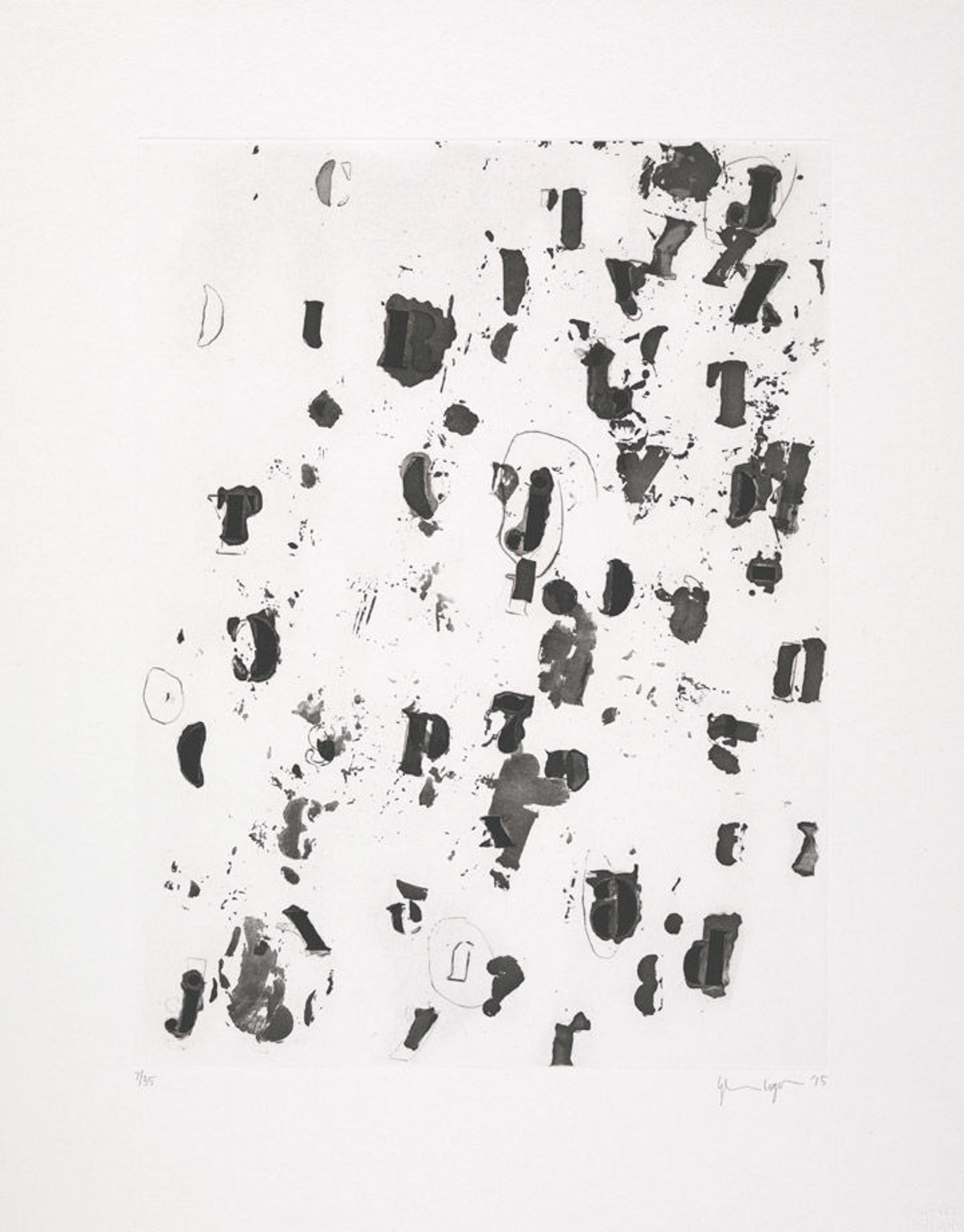
Glenn Ligon (American, born 1960). Debris Field II, 2015. Aquatint with sugar lift and drypoint and scraper; Plate: 16 x 12 in. (40.6 x 30.5 cm) Sheet: 21 1/2 x 17 in. (54.6 x 43.2 cm). The Metropolitan Museum of Art, New York, John B. Turner Fund, 2015 (2015.631)
Glenn Ligon has also employed isolated fragments of texts—including passages from celebrated African-American authors, quotations from political figures, and the artist's own prose—to question how such writings and the meanings they convey function when removed from their contexts. Without altering the text itself, he stencils the letters, evoking both impersonal sign painting and Johns's celebrated engagement with alphabets.
By contrast, Ligon pushes letters to the point of abstraction in Debris Field II. Letters created in tones of black and gray are scattered across the surface and, despite their stenciled forms, lack uniformity in tone, finish, and structure. Unlike earlier work, the letters do not derive from a quotation and instead bring to mind things that are left over such as thoughts that remain after a text is written or words unspoken, an effect amplified by their proximity to seemingly randomly placed smudges, scrapes, and stains. By removing meaning and order, Ligon examines how letters and language function when emptied out and used purely as image.
Suzanne McClelland
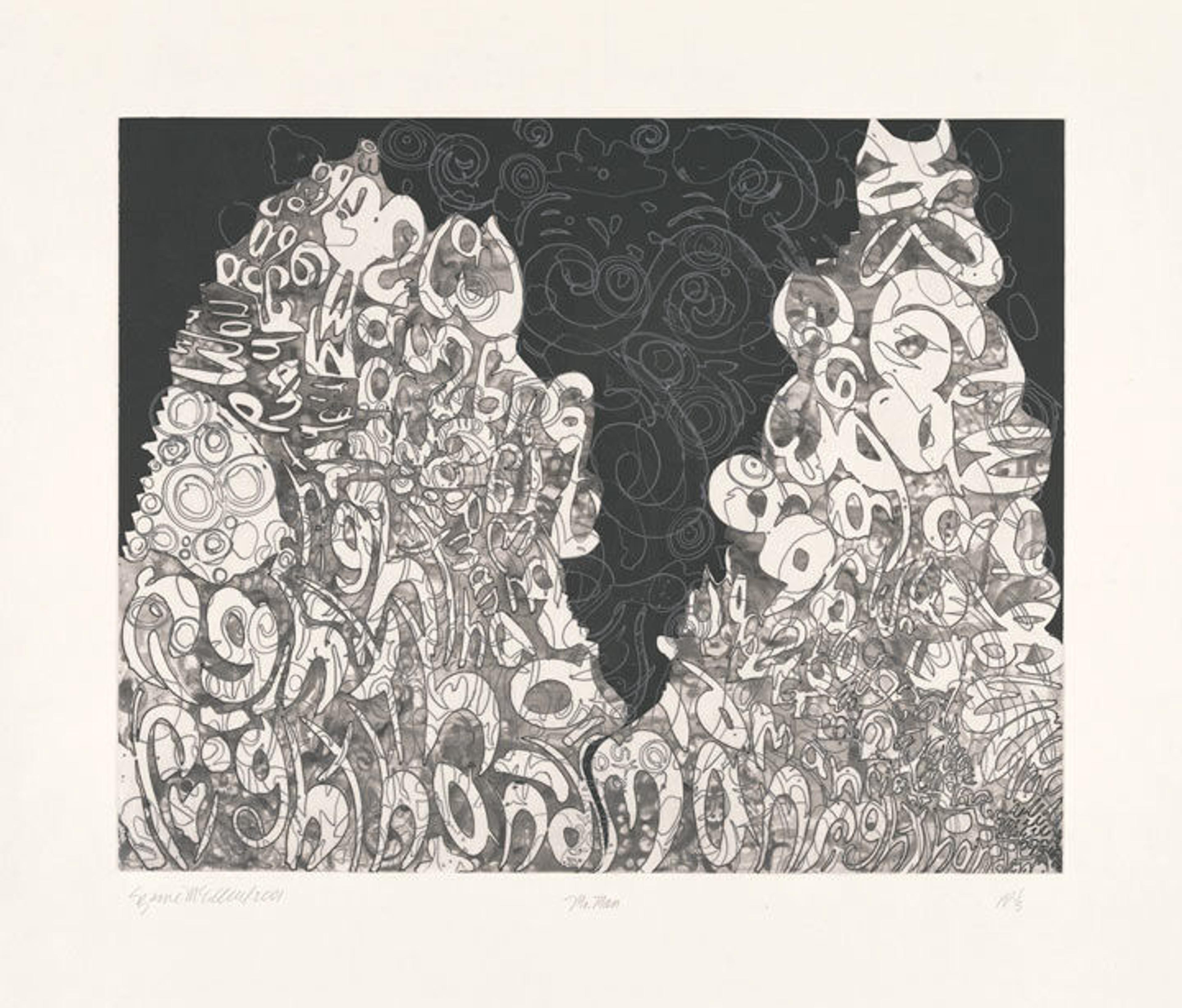
Suzanne McClelland (American, born 1959). Mr. Man, 2001. Aquatint with spit bite and sugar lift on custom-made Torinoko paper; Sheet: 32 3/8 in. x 38 in. (82.2 x 96.5 cm). The Metropolitan Museum of Art, New York, Gift of Craig and Elizabeth Zammiello, 2015 (2015.701)
Suzanne McClelland works with the appearance, sound, structure, and regulation of language in its various forms by examining found passages, both written and spoken, from which she "lifts" fragments. In Mr. Man, she distorts letters, turning them into near abstractions; while some hint at words, most represent only themselves, making up two towering mounds of discarded sounds or thoughts.
McClelland defies the dictates for reading (which, in English, involve moving from left to right and from top to bottom, a structure Johns applied in Gray Alphabets), instead making visible stutters, repetitions, ellipses, and other irregularities of oral rhythms. The title, Mr. Man, derives from an insult hurled against a celebrated writer in Stephen King's book Misery by a character memorable for her refusal to use crude language. However, it can also be read more broadly, as it calls attention to the underlying gender, racial, and social biases that often inform and structure language.
Louise Bourgeois
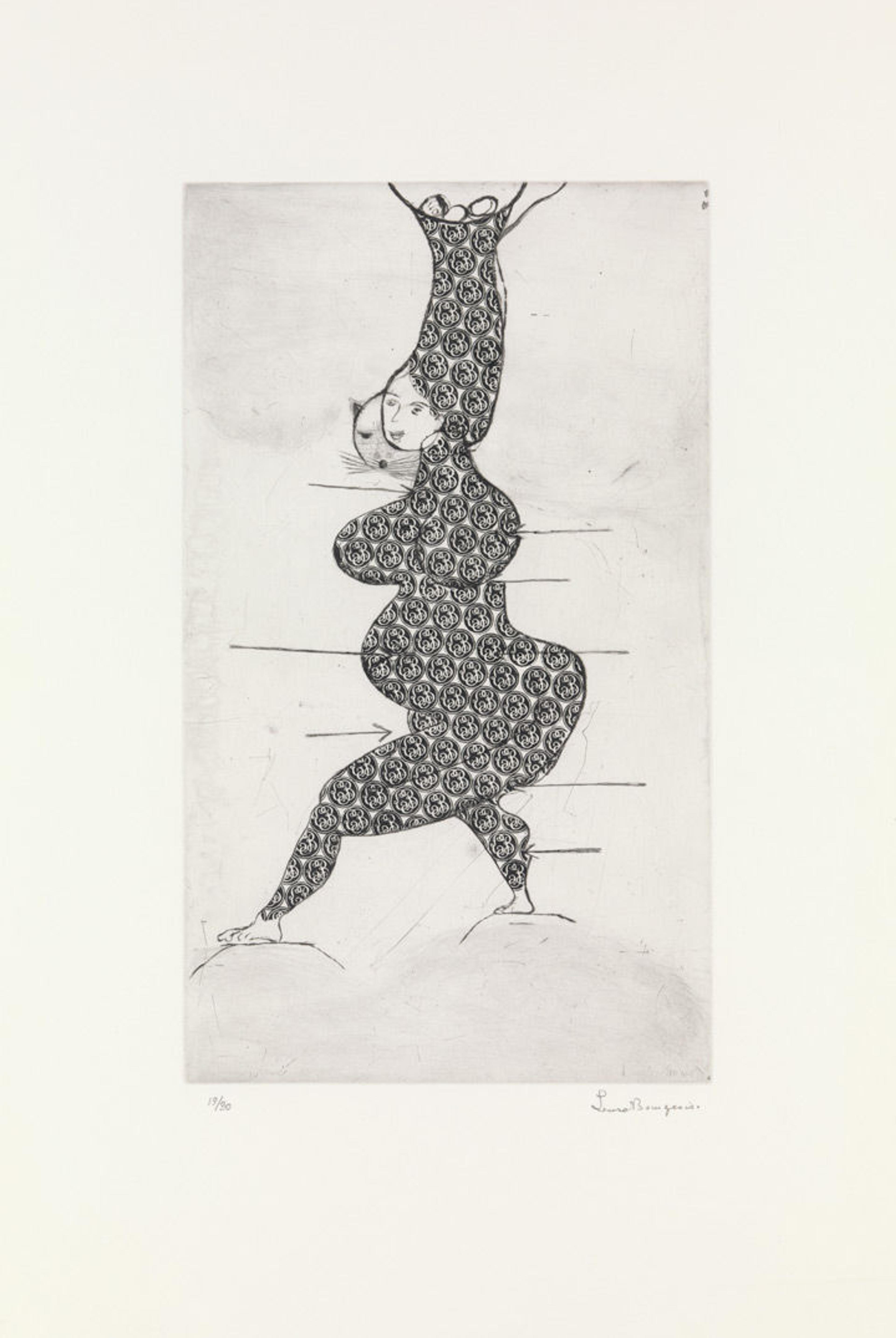
Louise Bourgeois (American, 1911–2010). Stamp of Memories I, 1993. Printed by Harlan & Weaver Intaglio. Peter Blum Edition. Drypoint and metal stamp; sheet: 25 3/8 x 17 1/8 in. (64.5 x 43.5 cm) plate: 9 13/16 x 16 7/8 in. (24.9 x 42.8 cm). The Metropolitan Museum of Art, New York, Stewart S. MacDermott Fund, 1999 (1999.128)
In Stamp of Memories I, which derives from her 1990 print Ste Sebastienne, Louise Bourgeois drew a mythical female version of the martyred saint running naked and smiling despite the arrows that puncture her body. As the print progressed, Bourgeois added a menacing cat's face and three eggs, perhaps alluding to her three sons, and covered the figure's body with circular stamping. Acting as a kind of skin or protective armor, the stamp contains the interlocking forms of "LB." Although the letters corresponds to the artist's initials, the stamp actually belonged to her father, Louis Bourgeois. Bourgeois rejected it and all it symbolized, and, in 1994, she produced Stamp of Memories II, where the less ornate and more easily read block letters of her own stamp cover the figure's body.
These works show just some of the ways artists have continued to find inspiration in language and letterforms.