Beautiful Tones in the Prints of Master IAM of Zwolle
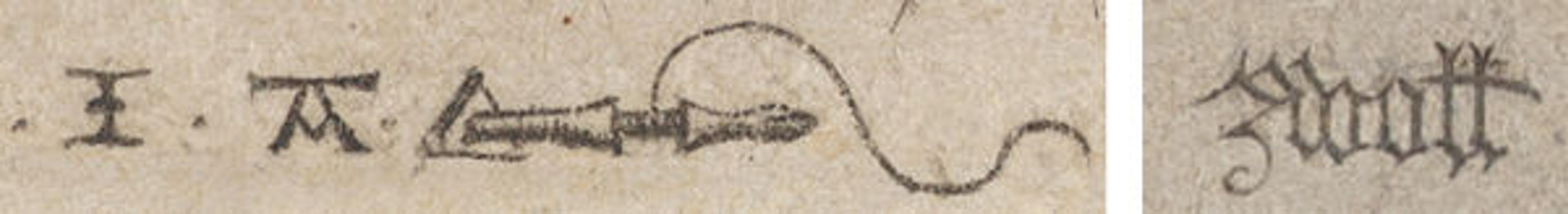
Two of the monograms identifying the Master IAM of Zwolle
«One might not consider engraving to be a particularly "colorful" medium. Made by impressing paper with an incised metal plate primed with a single color of ink—typically black—an engraving lacks the spectrum of chromatic options of other arts, like painting. But it can often be surprising, upon close inspection, just how much tonal nuance engraved pictures can contain.»
One of the first printmakers to explore tonal effects in engraving was the Master IAM of Zwolle (active ca. 1470–95), an early Netherlandish artist identifiable today only by his monogram—variably the letters IA or IAM, a goldsmith's drill, and the place name "Zwoll(e)."
He worked just decades after German goldsmiths first began experimenting with the medium of printed engraving in the 1430s to preserve designs they engraved into metalwork. Yet his distinctive prints, marked by their expressive shading, helped raise the bar aesthetically for the new medium. They facilitated an important shift away from engraving's utilitarian roots, aligning it more with the august art of painting.
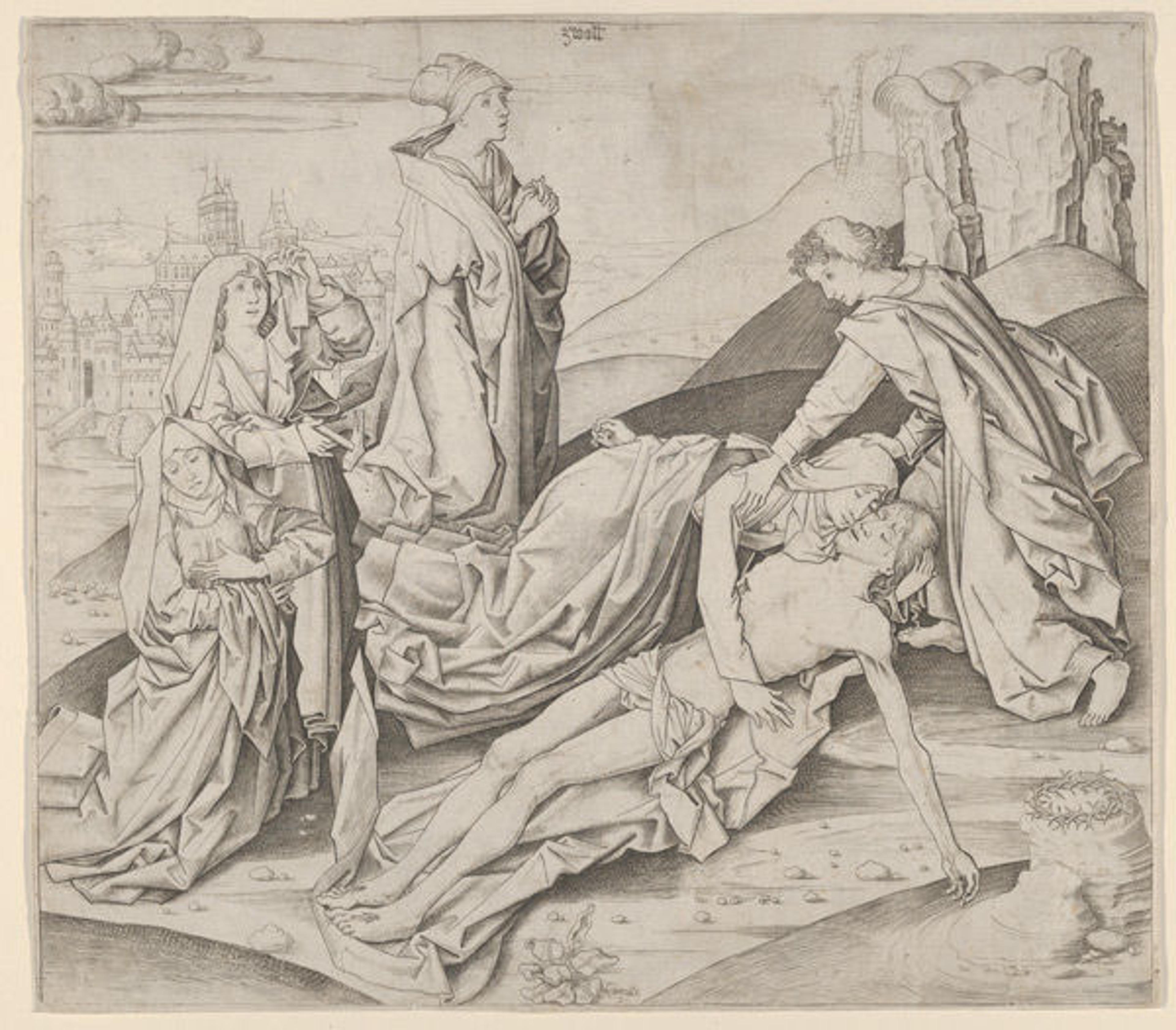
Master IAM of Zwolle (Netherlandish, active ca. 1470–95). The Lamentation, ca. 1475. Engraving, only state. The Metropolitan Museum of Art, New York, Purchase, Mortimer L. Schiff Fund, 1925 (25.48.3)
Master IAM of Zwolle's Lamentation, above, beautifully illustrates his tonal approach to printmaking. He bathes Christ, Mary, and Saint John in white light, silhouetting them against dark mounds receding into the distance. Despite the medium's limitation to a single color of ink, this early work by Master IAM of Zwolle exhibits a variety of shades of black, grey, and white, creating a sense of depth and drama in the scene.
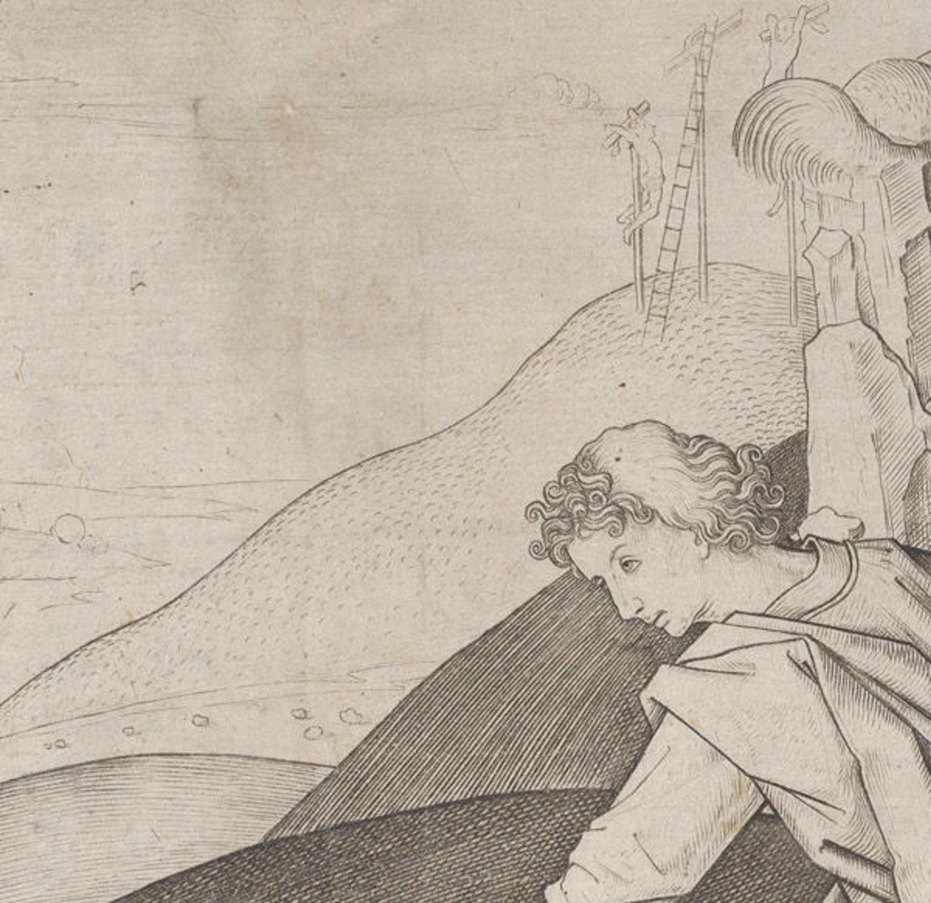
Detail of The Lamentation
In the succession of mounds behind Saint John, one can easily see the different techniques the artist used to achieve coloristic effects. Precise, dense cross-hatching in the foremost mound renders it nearly black; tightly spaced parallel lines in the mound behind it create a slightly lighter tone; and small flecks define the most distant topography. These tonal contrasts highlight Saint John's face and draw the eye to the upper part of the composition, where the minimally outlined site of the Crucifixion can be seen deep in the hazy distance.
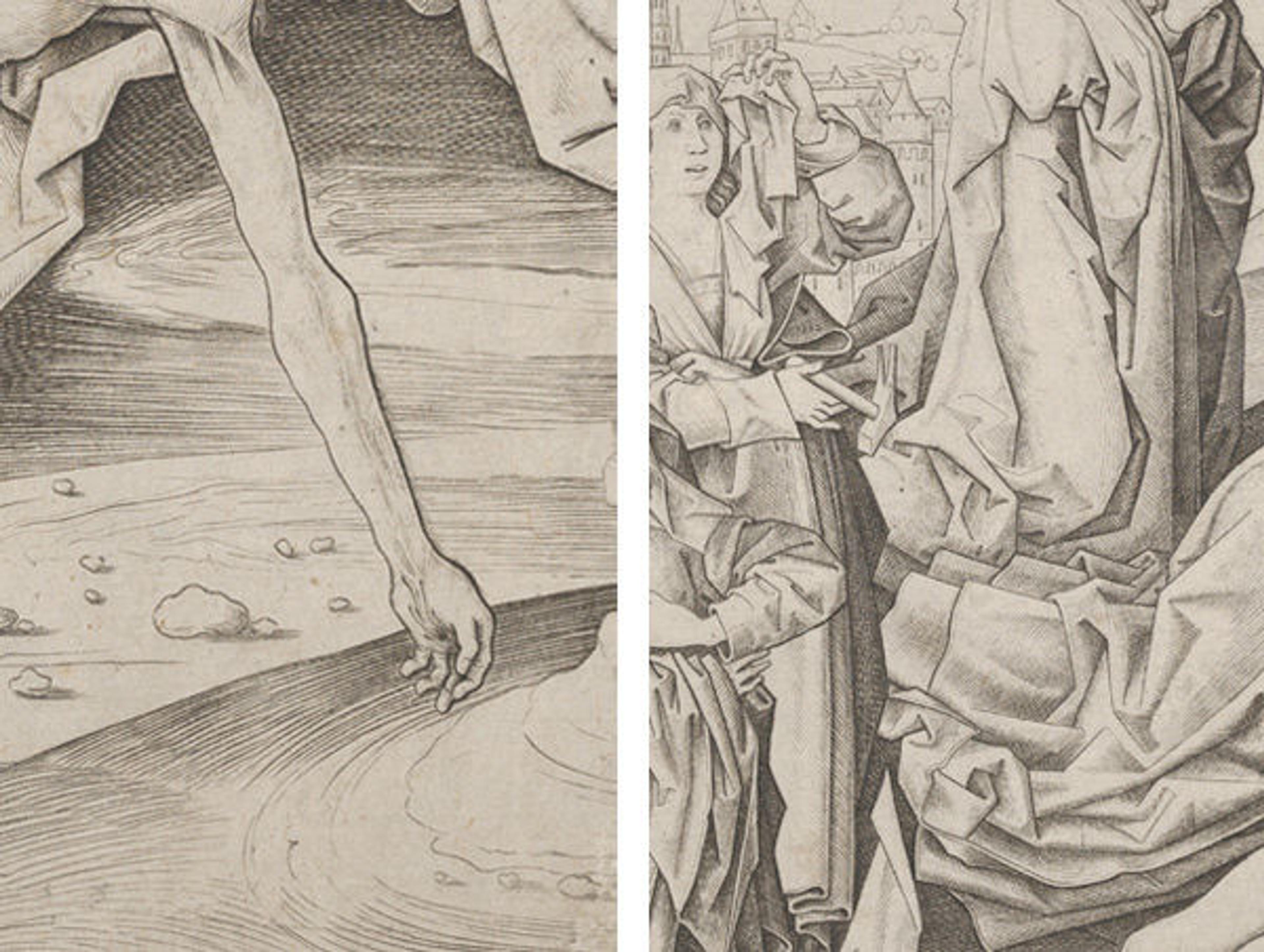
Details of The Lamentation
In the foreground, alternating light and dark bands in the rocky ground, swirling under Christ's arm like a whirlpool, draw attention to poignant details such as the veins protruding from Christ's wrist. Sharply defined folds and pockets of shadow in the figures' drapery also add rich tonal texture to the composition.
Like many of Master IAM of Zwolle's prints, this engraving is large—nearly the size of some contemporary private devotional paintings (see an example)—and it was probably meant to be used in a similar manner. The Metropolitan holds the only impression of this rare print in the United States.
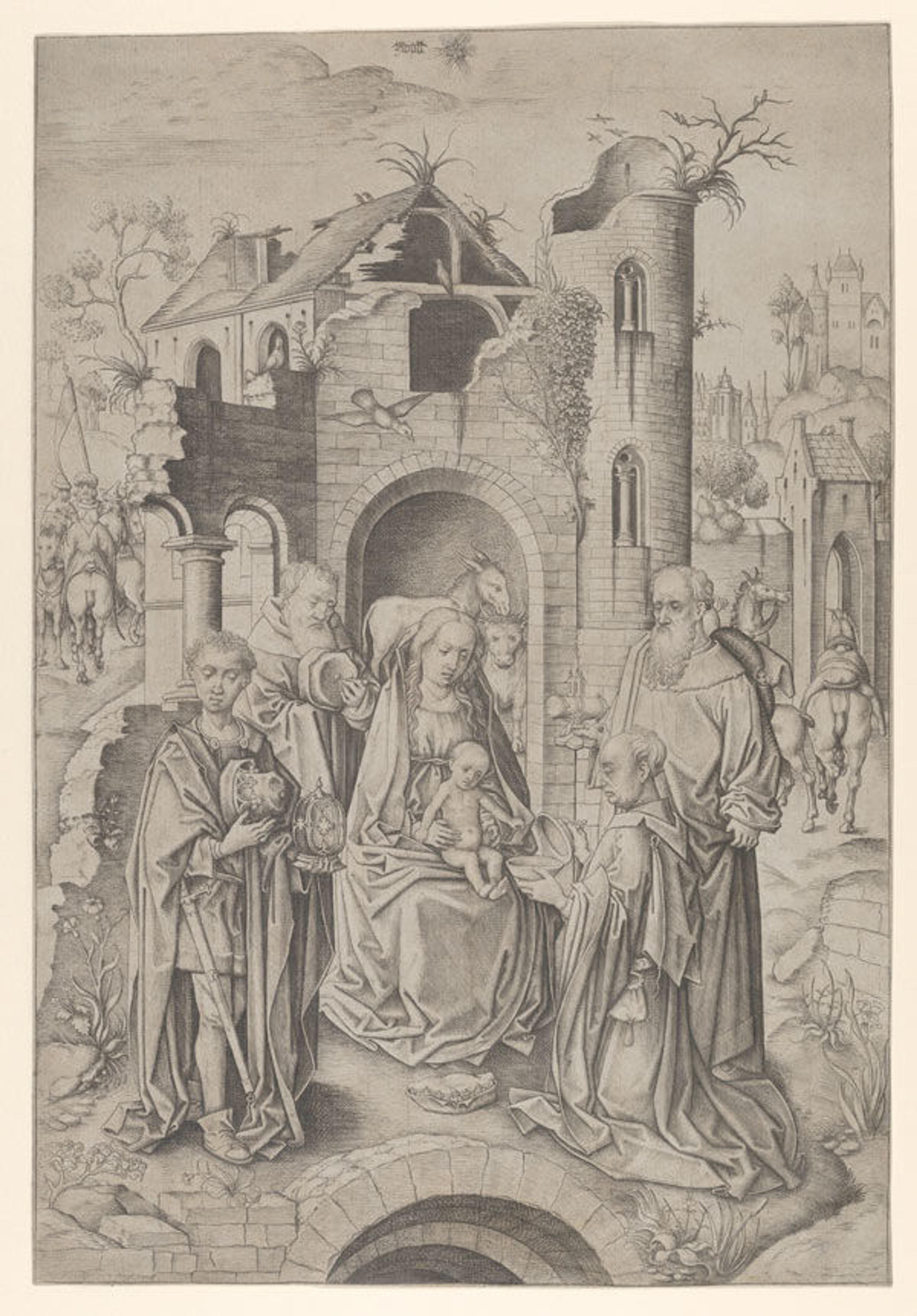
Master IAM of Zwolle (Netherlandish, active ca. 1470–95), Adoration of the Magi, ca. 1480. Engraving, only state. The Metropolitan Museum of Art, New York, Harris Brisbane Dick Fund, 1929 (29.20.1)
In another large print by the Master IAM of Zwolle, theAdoration of the Magi, one sees again his interest in subtle tonal effects. The artist set the scene in front of a dilapidated building, strategically adding shadows to the structure's walls and interior to focus attention towards the central figures. In the foreground, the magi flank the Virgin and Child, wearing shadowed, intricately creased garments that create a delicate, chromatic wall around the Holy Family. Throughout the exactingly engraved composition, the individual engraved lines almost seem less noticeable than the smooth, varied tones they combine to produce—an effect the artist no doubt intended. The brilliantly subtle modeling of the magis' faces, below, invites particularly close inspection in this respect.
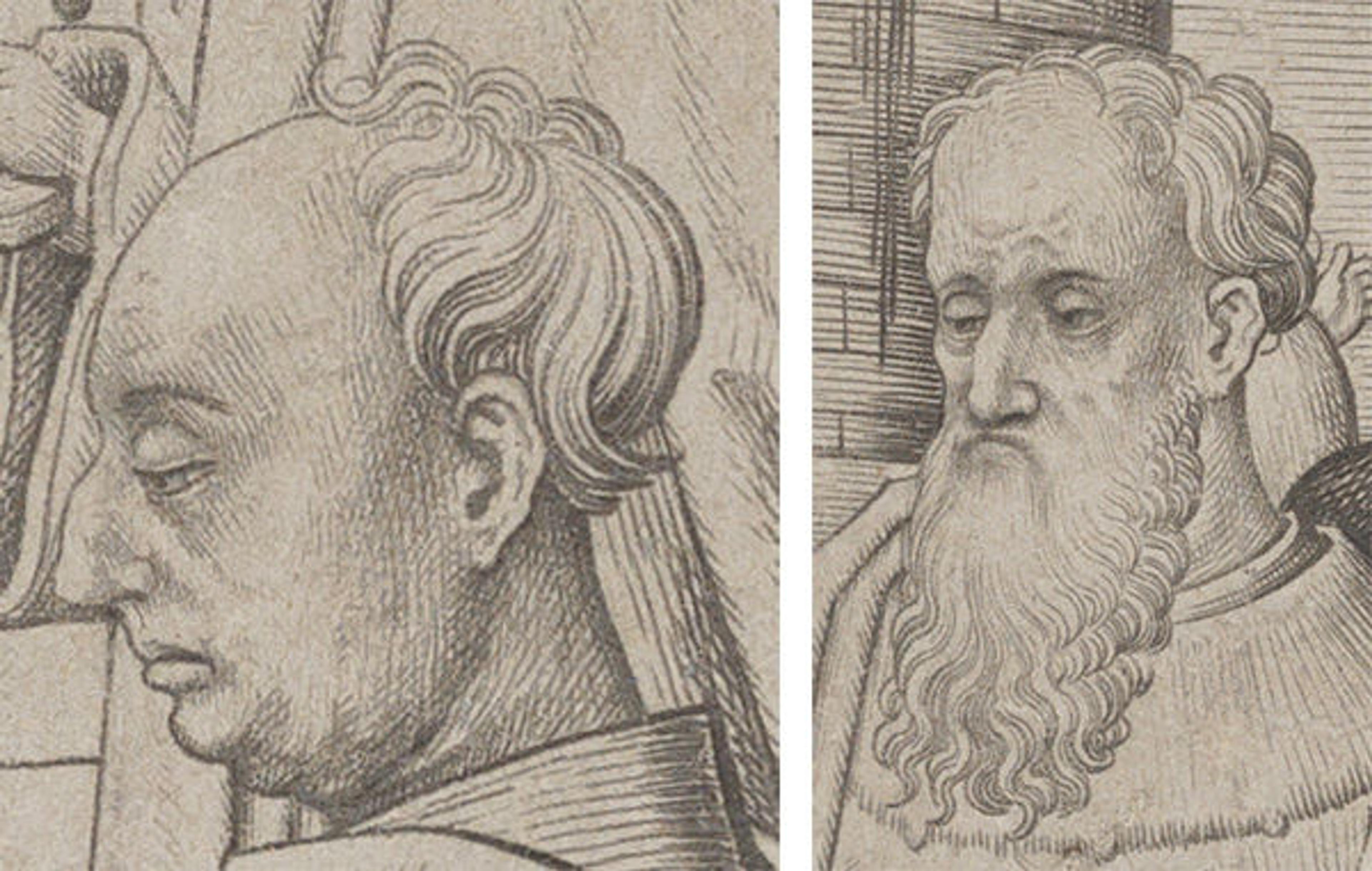
Details of the Adoration of the Magi
Such sensitive shading exemplifies how Master IAM of Zwolle's approach to tonality, and engraving in general, differed from that of preeminent contemporaries, like Martin Schongauer. As one can see in a detail of Schongauer's Christ Carrying the Cross, below, he employs a sophisticated network of overt lines and brisk flecks to describe forms, textures, and tonal shifts—a more linear style reminiscent of engraving on goldsmiths' work.
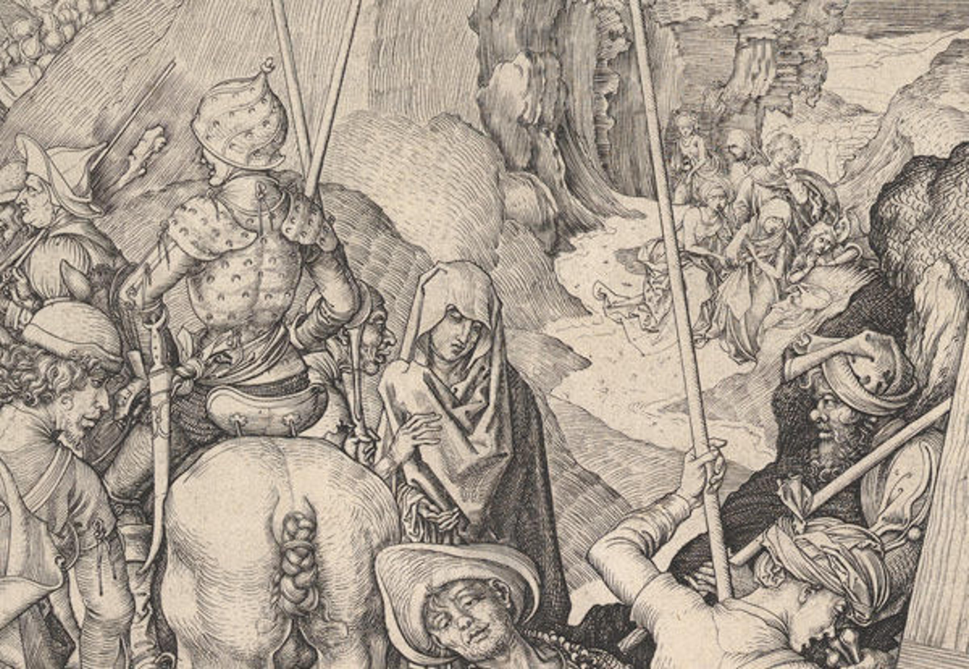
Martin Schongauer (German, ca. 1435/50–1491). Christ Carrying the Cross(detail), ca. 1475–80. Engraving, only state. The Metropolitan Museum of Art, New York, Purchase, The Sylmaris Collection, Gift of George Coe Graves, by exchange, 1935 (35.27)
Master IAM of Zwolle, in contrast, sought to reduce the appearance of individual lines and to define forms more through tonality itself—an elegant technique evocative of brushwork. This aesthetic advance in late Gothic engraving would serve as a critical precedent for northern Renaissance printmakers in the sixteenth century such as Albrecht Dürer (see an example) and Lucas van Leyden (see an example), among others.
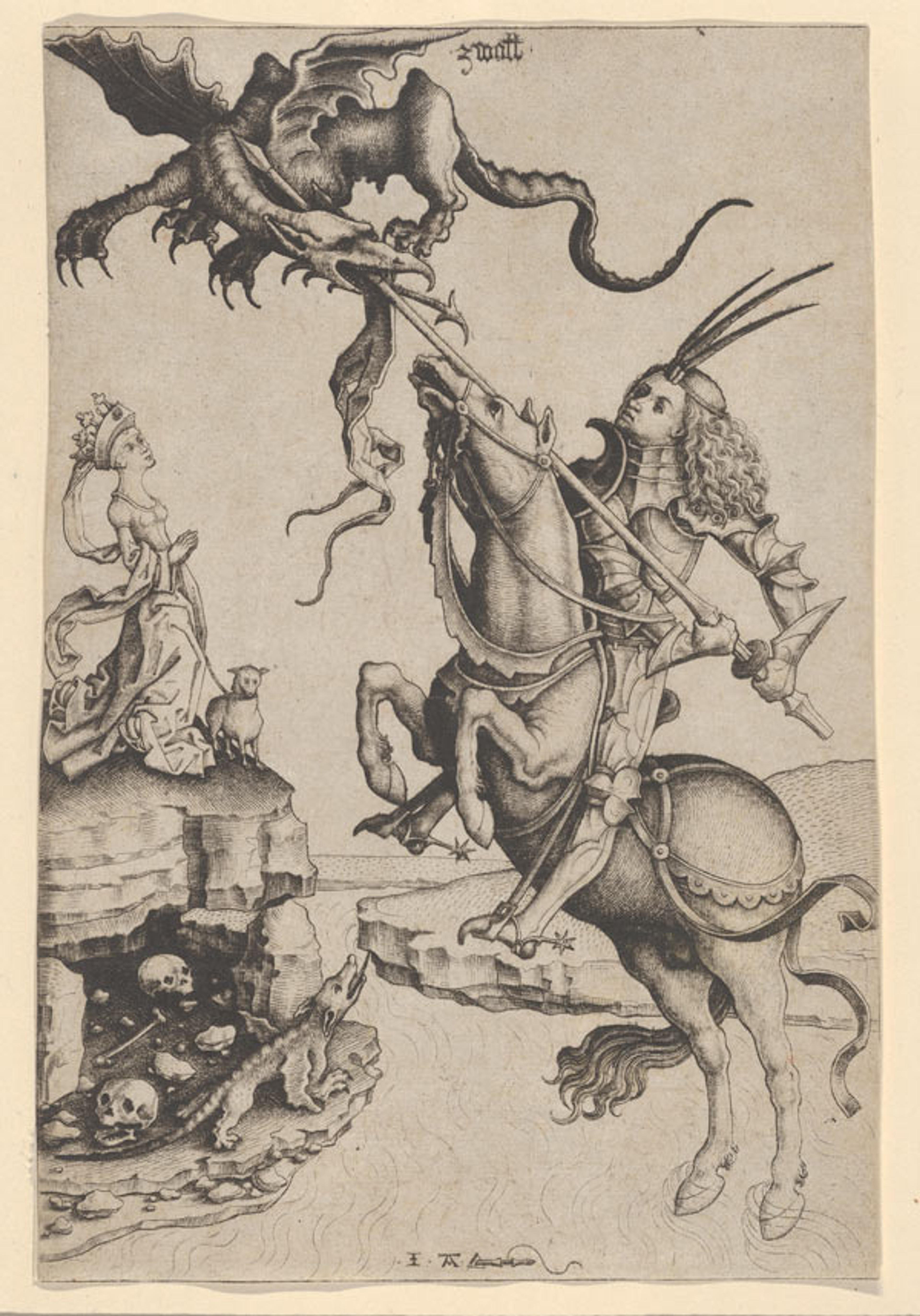
Master IAM of Zwolle (Netherlandish, active ca. 1470–95). St. George, ca. 1480–90. Engraving, only state. The Metropolitan Museum of Art, New York, Gift of Felix M. Warburg, 1933 (33.54.6)
Master IAM of Zwolle's St. George, above, one of the artist's most graceful compositions, again splendidly showcases his characteristically tonal approach. Here, contrasting tonalities also serve an additional, narrative function, helping to characterize the protagonists in the story. The artist plainly defines the dichotomy of good and evil through light and dark, brightly lighting the hero, Saint George, from the foreground while the ravenous dragon, shrouded in darkness, casts deep shadows upon him from above. Tonal contrasts also help balance the composition, with the horse's illuminated hindquarters on the bottom right echoing the black dragon in the opposite corner. Particularly beautiful passages include the horse's dark underbelly and rippling front legs, and Saint George's head ornament, which mirrors the dragon's whipping tail, below.
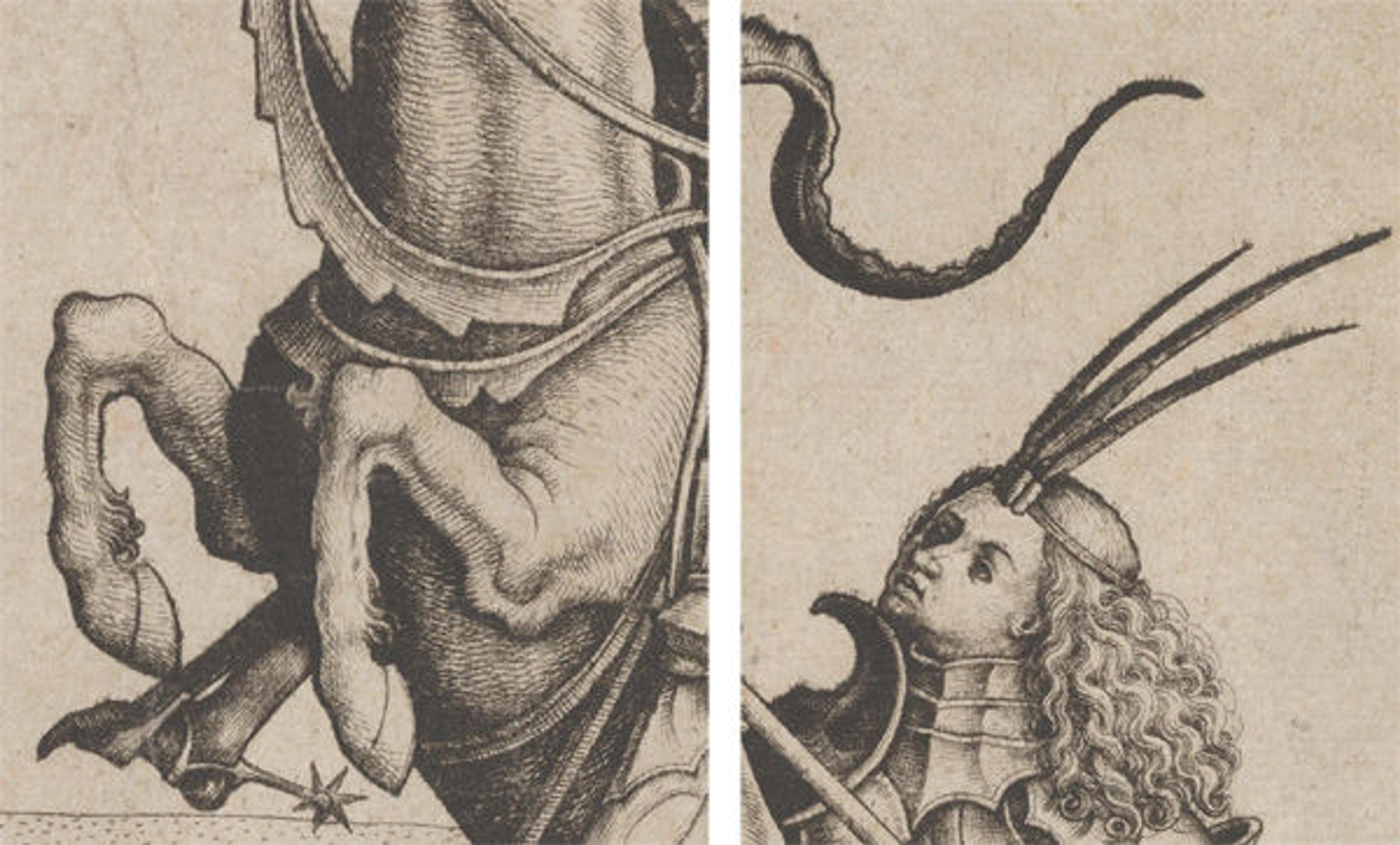
Details of St. George
Master IAM of Zwolle's ardent interest in tonal effects and their capacity to model fine details have helped lead some scholars to believe that he was not just a printmaker but a painter as well. Some have even proposed that his engravings are the result of a collaboration between two different artists—a painter, and an engraver who copied the paintings, which are now lost. Despite the uncertainty over the artist's identity, the quality and ambition of the pictures are undeniable. With eight impressions by the Master IAM of Zwolle in the Department of Drawings and Prints, the Metropolitan Museum not only holds one of the finest collections of his work in the United States but affords a unique opportunity to examine the distinct features of his colorful prints.

John Byck
John Byck joined the Department of Arms and Armor in 2015, having previously worked as a Research Assistant in the Department of Drawings and Prints. He has published and lectured widely on the topics of embellished European and American firearms as well as the history of the Department and its collection. At The Met, he has curated Japanese Arms and Armor from the Collection of John and Etsuko Morris (2018) and The Art of London Firearms (2019–20), co-curated Emperors, Artists & Inventors: Transformative Gifts of Fine Arms and Armor (2020–22), and contributed to other exhibitions and catalogues, including Visitors to Versailles (1682–1789) (2018) and Collecting Inspiration: Edward C. Moore at Tiffany & Co. (2024).