Firmin-Didot: A French Legacy
Catalogue illustré des livres précieux manuscrits et imprimés faisant partie de la bibliothèque de Ambroise Firmin-Didot. Paris: A. F. Didot, 1878–84. This auction catalog, recently acquired and one of over two hundred thousand in Watson Library's collection, provides an inventory of the sale of Firmin-Didot's book collection.
«Firmin-Didot, a family of French printers, punch-cutters, and publishers, gained renown for their illustrated editions of the classics, as well as for publishing inexpensive editions of scholarly texts. The former were illustrated by some of the most respected artists of the day, providing a wide audience with access to images that had only ever been available to those privileged few who had access to royal palaces and aristocratic chateaus. Making classic works—be they artistic, philosophical, or literary—available to a broad audience was only part of the family's influence, however. The family's most lasting legacy is the Didot family of fonts, designed by Firmin Didot, which influences typography to this day.»
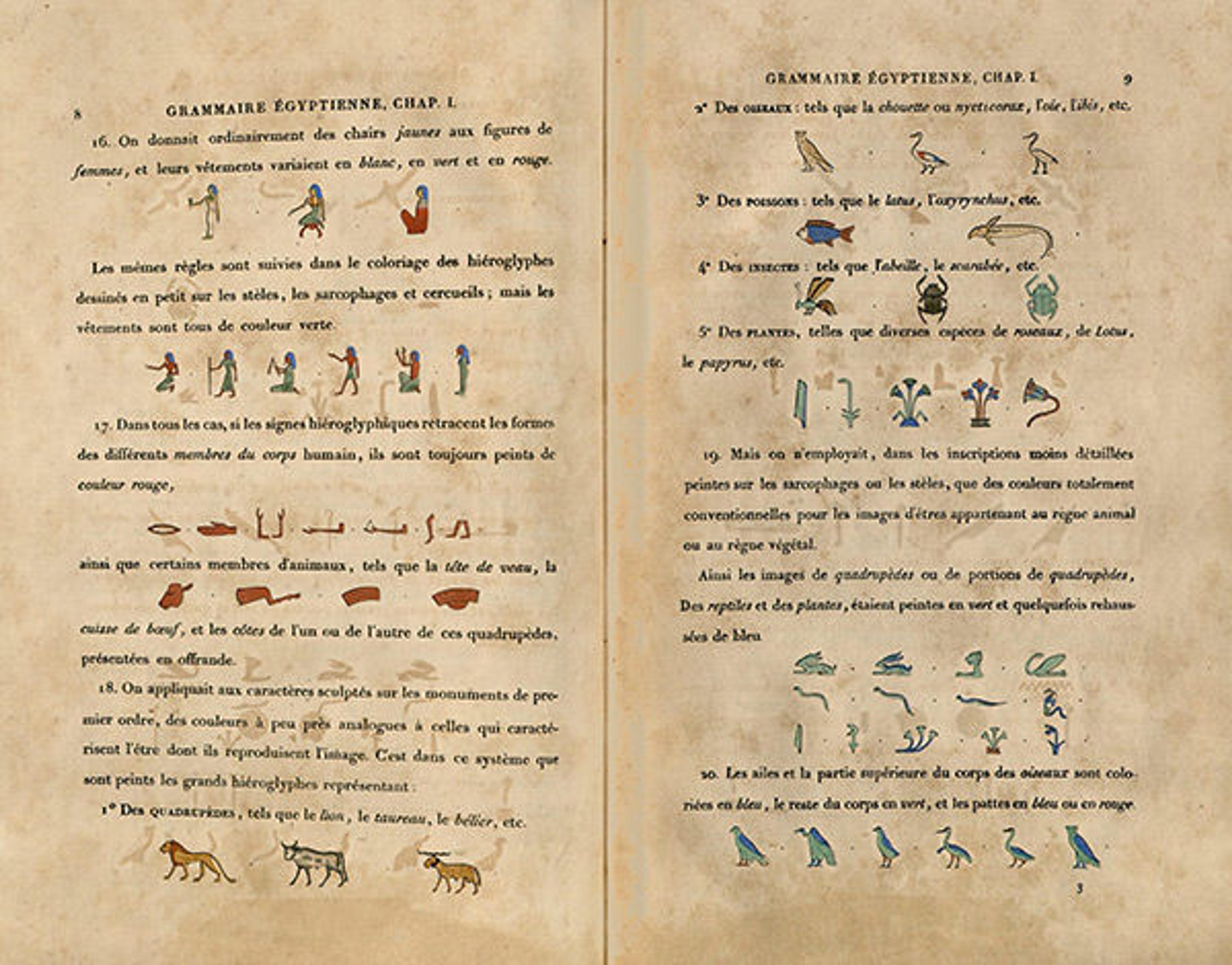
Champollion, Jean-Francois. Grammaire égyptienne: ou Principes généraux de l'écriture sacrée égyptienne appliquée à la représentation de la langue parlée. Paris: Firmin Didot freres, 1836–[1841]. Champollion's "grammar book," which translates Egyptian hieroglyphics and was a landmark publication in the field, one of the many important scholarly publications Didot printed.
Pierre: Illustrations and the Art of the Book
When Pierre Didot inherited his father's business in 1789, he set about reorienting the press towards elegant collectible books, hoping to bring glory to both the family name and the classical poets he loved. Pierre designed large, folio-sized books with wide margins, elegant type designed by his brother, Firmin, and sumptuous illustrations. These books, which often received luxurious bindings, were meant to be admired and appreciated as objects of art, not simply picked up and read.
Josiah W. (Josiah Willard) Gibbs (American, 1790–1861). Bibliorum Sacrorum Vulgatae versionis, 1785. Printed by François Ambroise Didot (French, 1730–1804). Height: 12 3/16 in. (31 cm). The Metropolitan Museum of Art, New York, Gift of Jayne Wrightsman, 2008 (BS75 1785b Q)
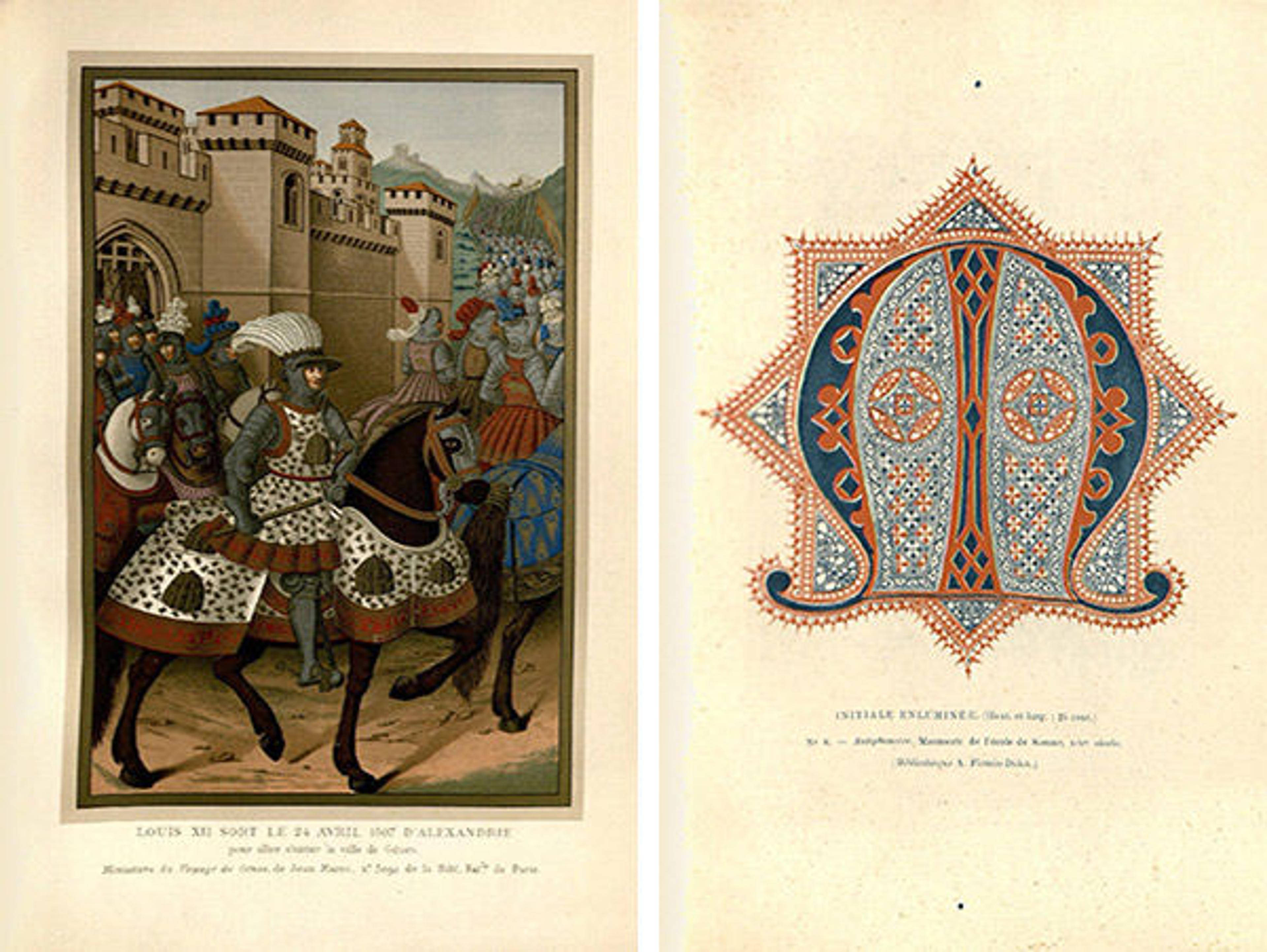
In 1797, Pierre was awarded a gallery in the Louvre in recognition of the work of the Didot press. During the next ten years, Pierre published three monumental works of Racine, Virgil, and Horace, known collectively as the Louvre editions. Pierre hired Jacques Louis David to edit the illustrations, which were executed by members of his studio, most significantly by Baron François Gerard and Anne-Louis Girodet-Trioson.
Jean Racine (French, baptized 1639–1699). Oeuvres de Jean Racine, 1801. Published by Pierre Didot l'ainé (French, 1761–1853), Paris. Printed books with engraved illustrations; 19 11/16 x 13 3/4 x 2 3/4 in. (50 x 35 x 7 cm). The Metropolitan Museum of Art, New York, Rogers, Harris Brisbane Dick, and The Elisha Whittelsey Funds; and Gift of John Sise, by exchange, 1958 (58.635.1[1–3])
David and his studio designed and engraved nearly one hundred illustrations for the folios. Not only did this collaboration provide much-needed patronage to artists during the difficult revolutionary days, it also brought their work into contact with a completely new demographic. After the Industrial Revolution more people were reading, and artists' whose work often hung in royal palaces were suddenly being seen by hundreds, if not thousands, of those in the widening middle class of France.
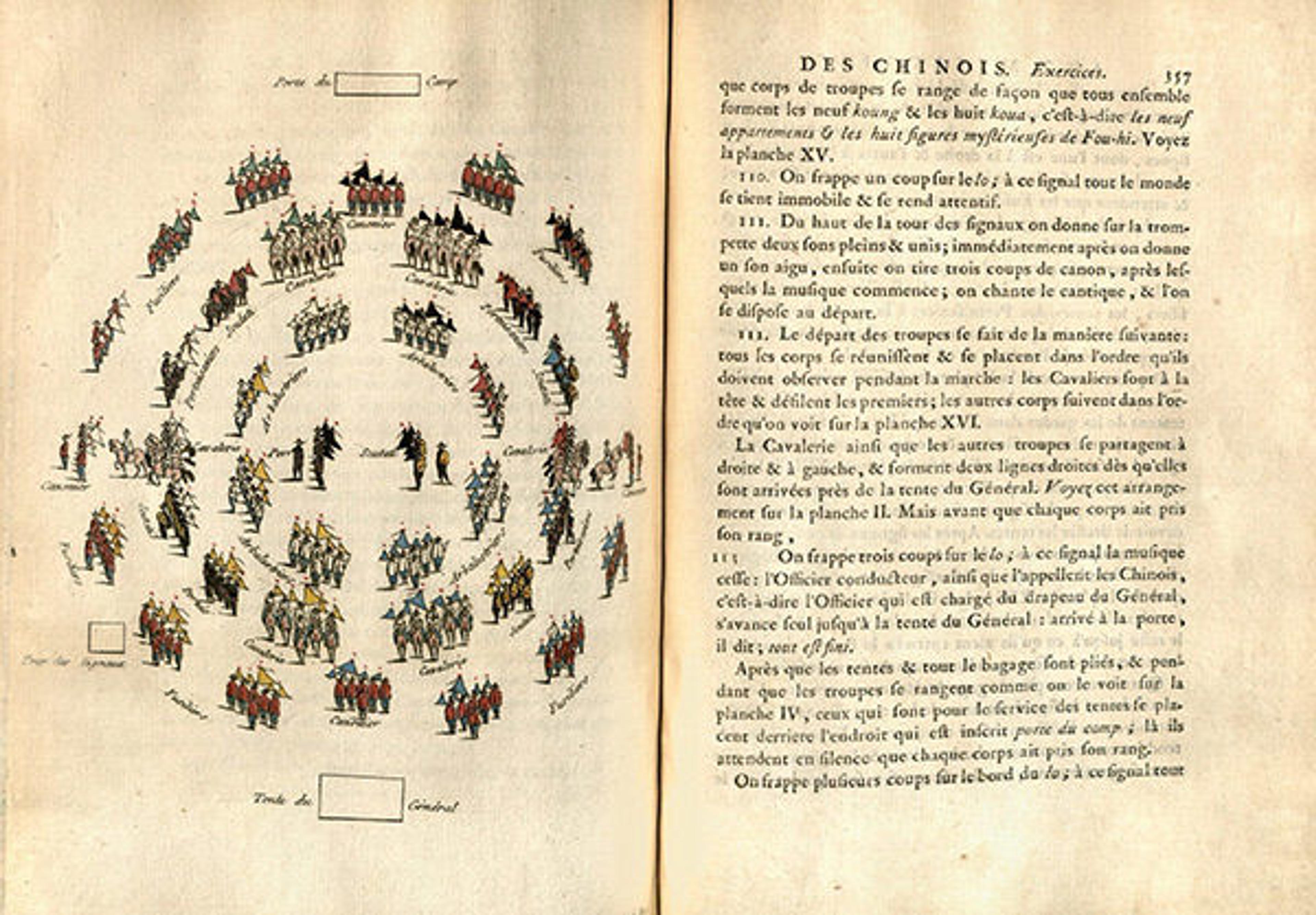
Amiot, Joseph Marie. Art militaire des chinois: ou, Recueil d'anciens traités sur la guerre, composés avant l'ere chrétienne, par différents généraux chinois. Paris: Chez Didot l'ainé, 1772.
These books were created at the end of the handpress period and serve as a kind of monument to the preceding 450 years of printing. In addition to providing patronage to David and his studio, the printing of the Louvre editions employed compositors, pressmen, draftsman, and engravers. The folios were the product of artistic collaboration and a system in which the printer (Pierre) still exercised control over the design and publication of the work. Shortly after the publication of the Louvre editions, new printing methods were invented and slowly started replacing the handpress.
Firmin: Typography and the Race to Create a Modern Font
During the letterpress period, words were printed from movable metal type, meaning each word was composed of individual pieces. To create a new font involved not just the design but also a lengthy and laborious process of cutting the individual pieces for each letter. Punch-cutting and casting were sophisticated, sculptural arts, and Firmin Didot was a master typographer.
When movable type was first created, fonts were designed to look as much like the handwriting of scribes as possible. This attempt to maintain the look and feel of manuscripts, known as Old Style, ended in the 1750s when the English printer John Baskerville designed the first Transitional typeface, known as Baskerville. His letterforms shifted the axis of rounded letters to a more vertical position, increased the contrast between thick and thin strokes, and created greater consistency in size and form. By the end of the century, printers throughout Europe were racing to perfect Baskerville's designs.
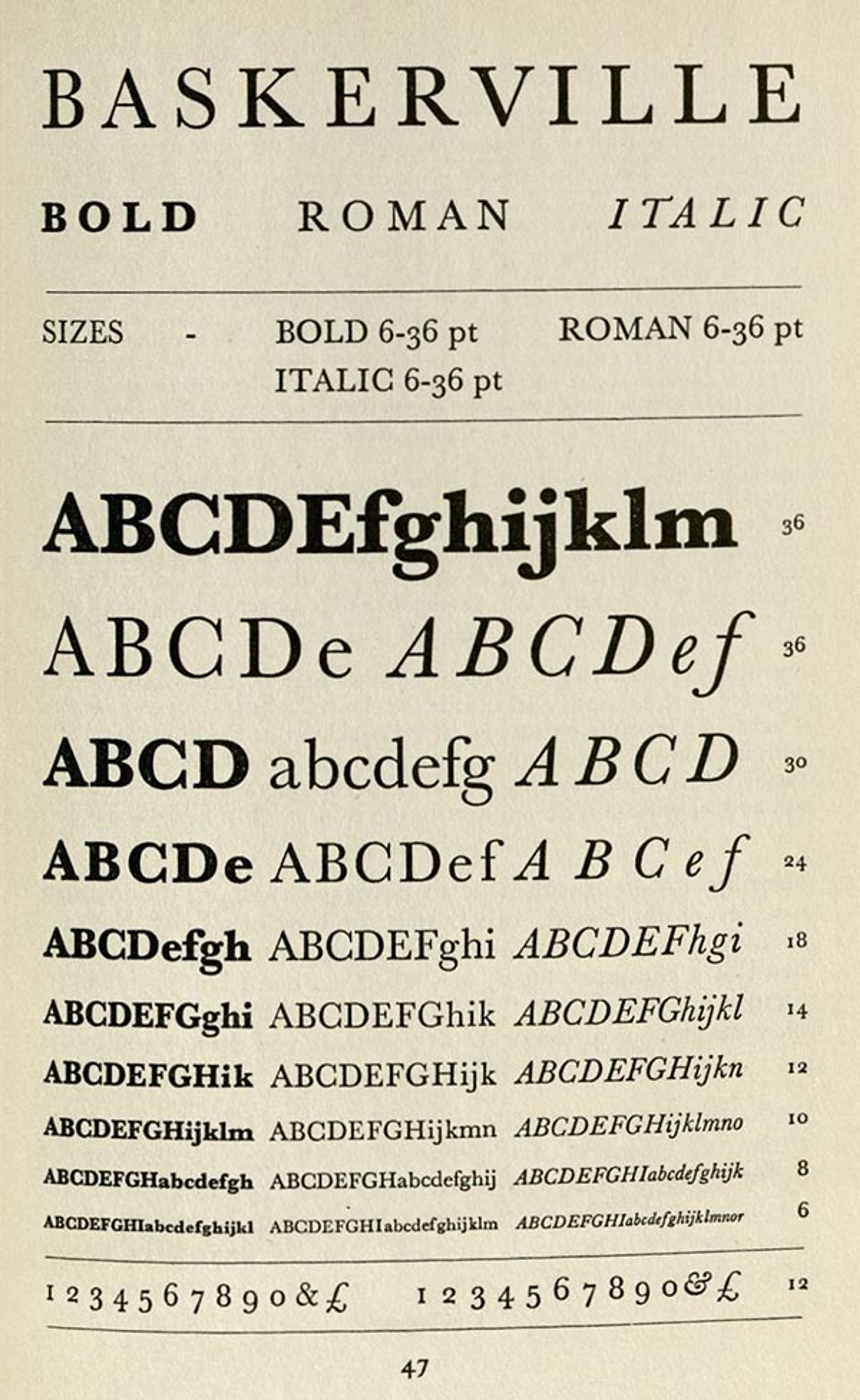
W. S. Cowell Ltd. A handbook of printing types with notes on the style of composition and graphic processes used by Cowells. London: W. S. Cowell, Distributed by Faber and Faber, 1948
Firmin was inspired by Baskerville's typeface and took his experiments in letterform to the extreme, designing his first font in 1784. This font, regarded as the first Modern typeface, has high contrast between thick and thin strokes, hairline serifs with no bracketing, and vertical stress in rounded strokes.
Thirty years later, an Italian type designer, Giambattista Bodoni, started creating his own Modern typeface. He also admired Baskerville, and his designs were greatly influenced by Didot. Bodoni's letters were dramatic, with horizontal serifs and high contrast. Viewing Baskerville, Didot, and then Bodoni alongside each other shows an important transition into Modern typography.

Today, Didot's legacy can be seen in the "modern Moderns." Modern typefaces tend to denote luxury brands, and are often used on the covers of fashion publications such as Vogue. Since Didot created his first typeface in the eighteenth century, many typographers have created designs inspired by the Didot type family, and these new interpretations pay tribute to the impact Didot had on the world of typography.
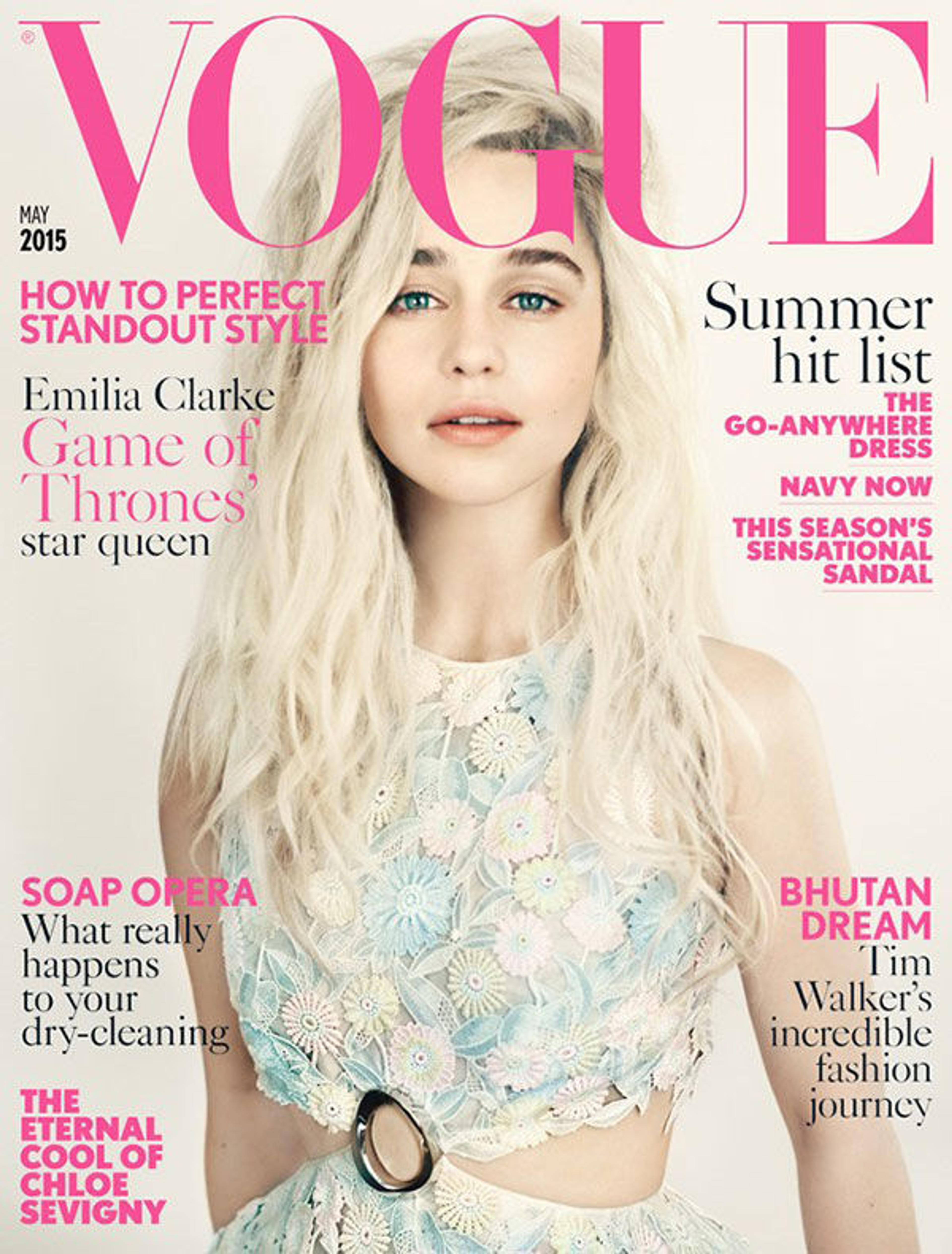
Vogue, May 2015, from the Vogue Magazine Archive. The extreme contrast between thick and thin strokes, perfected by Didot over two hundred years ago, is typical of Modern fonts.
Search for all the works discussed here and more in our online catalog, WATSONLINE.
Dana Hart
Dana Hart is the manager for library administration in the Thomas J. Watson Library.